This is the 15th installment of my monthly feature on Typewolf where I share my favorite type-driven websites from the previous month and then write a little about the typographic details behind the designs. You can check out last month’s post for March here.
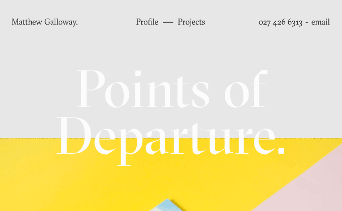
Matthew Galloway
GT Sectra is surprisingly versatile for a calligraphy-inspired typeface—at larger sizes the display version shows off fine details derived from a broad nib pen but at smaller sizes the book style cuts back on the contrast, making a perfectly readable text face. Matthew did a great job setting the body copy as well—the narrow line length is easy to read and smart quotes and dashes are used throughout.
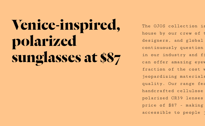
OJOS Eyewear
Dala Floda, a stencil typeface inspired by worn lettering found on tombstones, makes for a distinctive display face on the OJOS Eyewear site. Cutive Mono, a monospaced typewriter face available for free on Google Fonts, is used for body copy. Cutive Mono doesn’t contain italic or bold styles, so it’s not ideal for body copy, however, for the small amounts of copy on this site I think it works fine. Another monospaced font, Letter Gothic, is set entirely in uppercase for headers. Letter Gothic is a condensed design so it lends itself well to being set in uppercase.
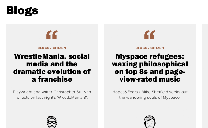
Hopes&Fears
The type on this site takes a super unusual approach—different typefaces are swapped out in mid sentence. The body text is set using Merriweather but the italics inside the body text switch to Adobe Text. There are pull quotes that will start with Franklin Gothic and then switch to Adelle. In other places, bold Franklin Gothic will change to Proxima Nova. This gives the site somewhat of a haphazard and disorderly feel, however, the content on the site is a crazy mishmash of different topics so perhaps this is exactly what the design called for.
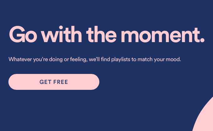
Spotify
Both Airbnb and Mint started using Circular in their recent redesigns, so when I saw that Spotify chose Circular for their new redesign as well, it felt a little uninspired to me. But that’s just my perspective from someone who looks at type on the web all day—I’m sure for their target audience it’s a refreshing typeface choice. But I’m hoping that Circular won’t become the next Proxima Nova due to every site adopting it. I do like how they set Circular tightly with negative letterspacing for the headlines—it gives it a slightly different feel when set this way.
Access Ventures
I love when type is set at a huge size like this and the details of the letterforms become the main design element of the page. Caslon has been surprisingly popular lately on the web but you can’t really call it trendy since it has been a popular typeface choice for several hundred years. Theinhardt, a neo-grotesque that makes a great alternative to Helvetica, makes for a nice combination with Caslon.
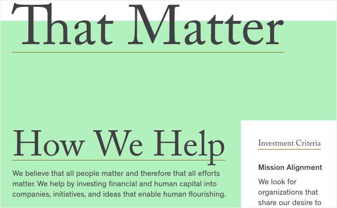
Institute for New Economic Thinking
Content-heavy sites with a corporate feel like this are probably my favorite type of site to feature on Typewolf. There is nothing artsy about them to make them stand out—they just rely on solid typography and that makes them hard to do well. This site is currently in beta but I really like what I see so far. The logo uses Neutraface and Atlas Grotesk is paired with Freight Text, one of my favorite body text fonts.
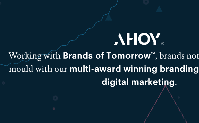
Ahoy
This is another site that switches typefaces in mid sentence, although in this case it is done very sparingly. Neuzeit is the primary typeface and Portrait, a serif from Commercial Type, is used sparingly as a secondary typeface. Neuzeit is interesting in that there have been several different versions of it released throughout the years by different foundries—some versions have a single-story a and others a double-story a, so it can sometimes feel geometric like Futura and other times more like a neo-grotesque depending on which version is used.
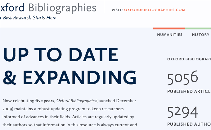
Oxford Bibliographies
This site is a great example of demonstrating what can be done using just a single typeface. Calluna Sans is set in a wide variety of styles—regular, bold, italics and letterspaced uppercase—creating a clear hierarchy and enough contrast without the need to introduce a second typeface.
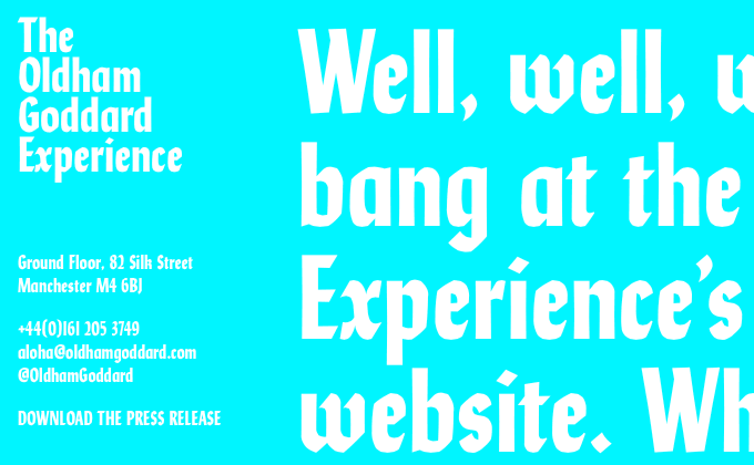
Oldham Goddard
Lydia is Colophon Foundry’s condensed take on Lydian, a calligraphic typeface from 1938. The white on cyan text creates a harsh contrast but judging from the website copy, that is exactly what the designers were aiming for.
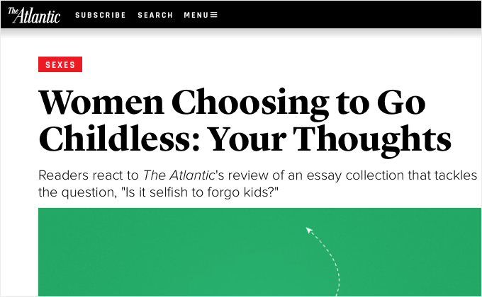
The Atlantic
For the most part, I really dig the new redesign of The Atlantic. It’s great to see them using a proper display face for headlines (Lyon Display) and a proper text face (Lyon Text) for body copy. Rajdhani is an open-source font available on Google Fonts that I was completely unfamiliar with, so it was kind of cool discovering it for the first time in such a prominent redesign. The ubiquitous Proxima Nova is used sparingly—mostly for subheadlines. The body text uses proper quotes and apostrophes, however, the large headlines use dumb quotes, which is a shame because that is exactly where they are the most noticeable.