This is the 10th installment of my monthly feature on Typewolf where I share my favorite type-driven websites from the previous month and then write a little about the typographic details behind the designs. You can check out last month’s post for October here.
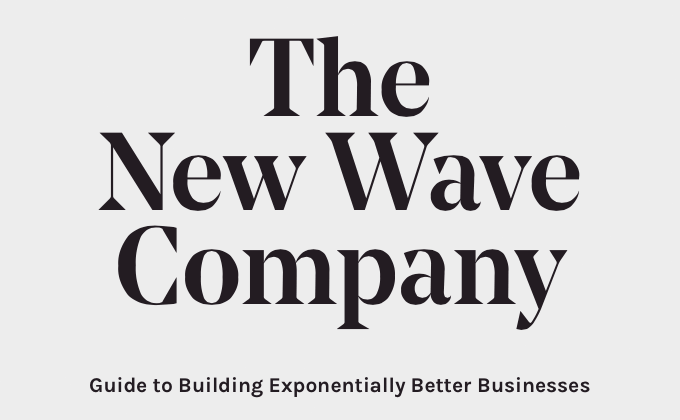
The New Wave Company
Noe Display is a distinctive display face with its pointy triangular serifs. I think it pairs well with the quirky open-source font Karla. My only nitpick about the type is how the paragraph line length expands to fill the browser window—on a smaller screen it’s not an issue but on a large screen like mine, it’s a little too wide for optimal reading.
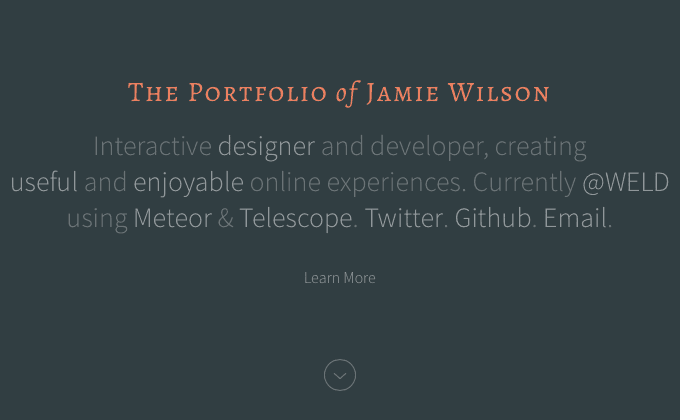
Jamie Wilson
There isn’t much type on this site, but the type that is here is set really well with some nice touches. I love how the title uses the small caps style of Alegreya with the “of” set in lowercase italics, providing a touch of formality. The thin weight of Source Sans Pro works well to not overpower the refined title text.
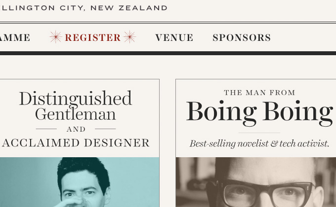
Webstock
The type on this site is really unusual in that the text set in Harriet above each photo doesn’t follow any kind of template. Instead, there’s a custom, one-off layout for each one that uses a SVG image rather than web text. Generally, using images in place of text is considered a bad practice, however, on this site it makes things so much more interesting and engaging. The header is an SVG image as well, set in Domaine Display and Knockout.
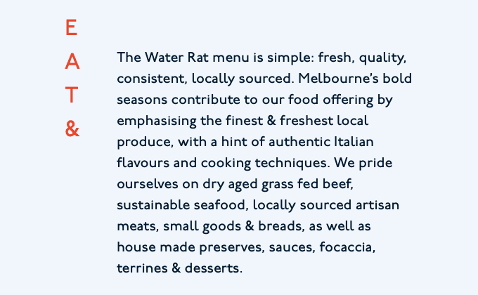
The Water Rat
With its distinctive character, P22 Underground is the perfect typeface choice for this simple, yet quirky site. There are several small details that I really like that make this site stand out. The type set vertically is a nice touch and the paragraphs are set in the more traditional print style, with each paragraph using an indent rather than a line break.
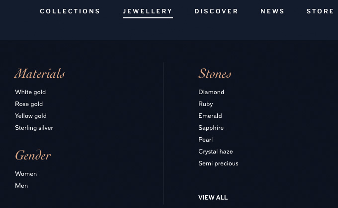
Stephen Webster
Cochin is a wonderful serif that is seldom-used on the web. The italic is especially beautiful and looks elegant and refined on this jewelry site. The Stephen Webster logo looks like it uses a slightly-altered version of Cochin, with an extended tail on the “R.” Armitage, a sans-serif typeface from Dunwich Type Founders, makes for a nice combination with Cochin.
Fedrigoni
Folio is a neo-grotesque that was released around the same time as Helvetica and Univers, although it’s not nearly as popular as those two typefaces. This is the first time I’ve encountered it on the web. It has a lower x-height than Helvetica, so it’s a little more distinctive looking. The Bauer version of Bodoni is combined with Folio, adding a bit more formality to the design.
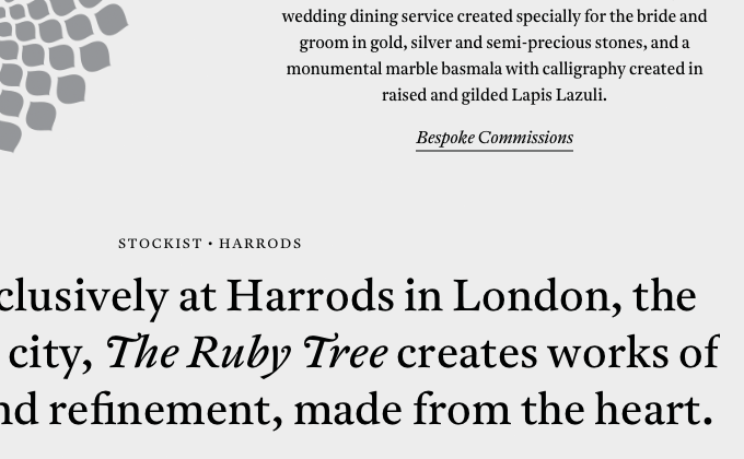
The Ruby Tree
Antwerp is a serif typeface from A2-Type with beautiful, ultra-sloped italics which this site features prominently. I really dig the italic ampersand of Antwerp as well, which you can see used in the intro copy at the top. The sans-serif Neuzeit is used sparingly for the nav and footer.
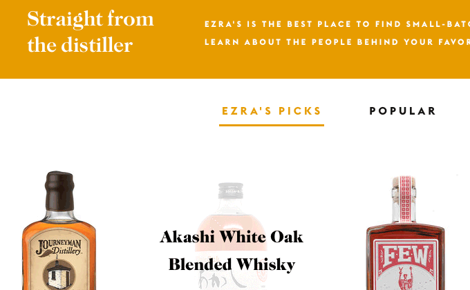
Ezra’s
The heavier weights of Caslon give this design a stout and sturdy feeling. The use of Euclid Flex, set almost entirely in uppercase with a generous amount of letterspacing, adds a contemporary touch. The one thing I have to call out is the use of straight quotes instead of proper apostrophes in the type in the hero graphic. For small text it’s not as noticeable, however, for large type like this, the lack of proper apostrophes really stands out.
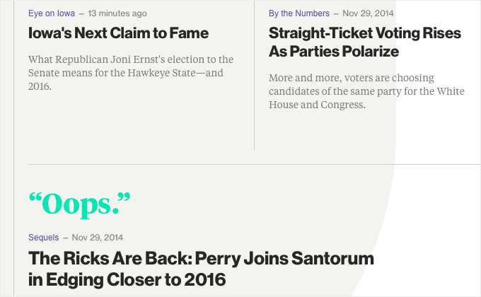
Bloomberg Politics
I love when a big news site pushes the boundaries of web type like this by going all out with web fonts. Neue Haas Grotesk, the original Helvetica, looks wonderful on the chunky headlines. Both the headline and text styles of Tiempos are used beautifully. However, there are still bits of Arial mixed in here and there, most likely left in the design inadvertently.
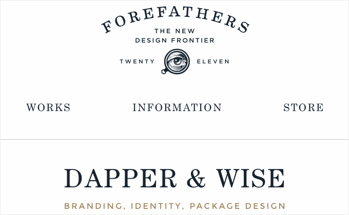
Forefathers Group
This site uses a simple and consistent type system. Both Century Schoolbook and Montserrat are set entirely in uppercase, while Fjord One is used for paragraphs. Both Montserrat and Fjord One are open-source fonts available for free on Google Fonts. Fjord One doesn’t contain any italic styles, so it’s not ideal for setting body copy, however, for the small amounts of text here it works fine. It’s nice to see the logo type using a crisp and scalable SVG.