This is the 23rd installment of my monthly feature on Typewolf where I share my favorite type-driven websites from the previous month and then write a little about the typographic details behind the designs. You can check out last month’s post for November here.
American Imagery Bank
With flat design all the rage, it’s kind of refreshing to see a site that uses a little bit of background texture. It seems to add a touch of warmth to the type. I dig the combo of Futura and Refrigerator Deluxe here—both are geometric sans-serifs but they are different enough to provide sufficient contrast even when they are both set in all caps next to each other. Century Schoolbook has a mostly geometric skeleton so it’s a nice serif to pair with the two geometric sans-serifs.
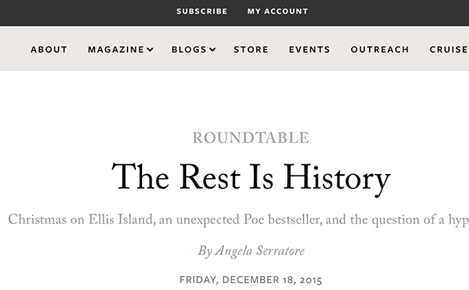
Lapham’s Quarterly
This site does an excellent job of taking a simple typographic palette—just Caslon and uppercase Freight Sans—and making it go a long way. Lighter shades of Caslon are used strategically to place emphasis on the article headlines and the use of italic and uppercase Caslon helps create even more typographic contrast. Smart quotes and apostrophes are used properly which is important for such a literary site.
Sway Water
The Sway Water site really shows off how far free fonts have come. All four of the fonts used here—Playfair Display, Droid Sans Mono, Karla and Montserrat—are from the Google Fonts library. Normally using four different typefaces in a design can be a bit too much but here it seems to fit the playful and colorful aesthetic of the site.
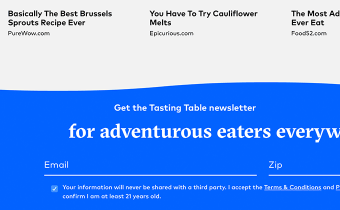
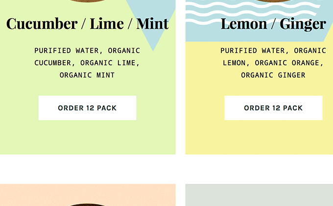
Tasting Table
I’m used to seeing GT Sectra set in the lighter weights and more high contrast Fine and Display cuts, so seeing it set here in the regular cut in bold made me not recognize it at first. It definitely feels less sharp and trades in some of the scalpel knife qualities in favor of a more classic broad nib pen look. FF Mark seems to be growing in popularity as a more friendly, humanist alternative to Futura and it makes a great pairing with GT Sectra. The brush script face, Quick, makes an appearance as well for headers.
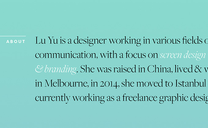
Lu Yu
I dig how the type on Lu Yu’s site is set in both normal and reversed (dark and white) against a colored background. It’s a great trick to create contrast and make type pop out for emphasis. The serifs Freight Big and Freight Text are both pretty common typefaces but this is the first time I’ve encountered the geometric sans-serif Filson. It feels similar to Futura on first glance but the curvy tail on the t and R make it stand out.
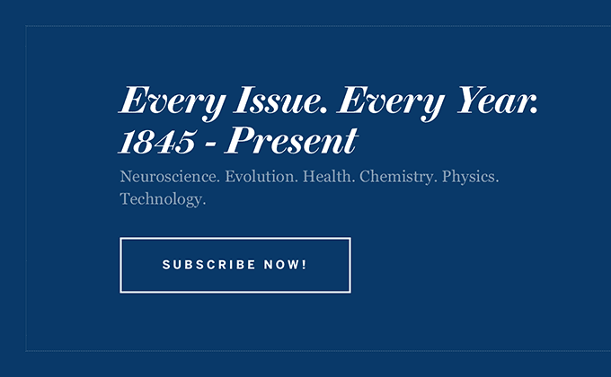
Scientific American
Brunel is a serif typeface created by the guys from Commercial Type before they had actually partnered to form their type foundry. It’s not available for purchase through their site but Scientific American were able to get their hands on it for their recent redesign. It looks wonderful on the new site which takes a clean, type-driven approach. Much of the type on the site is set centered which adds a formal touch. Benton Sans is set with generous letterspacing for the navigation and auxiliary text. Even though Brunel contains styles for setting text, the body copy is set in Georgia, which actually pairs quite nicely with Brunel. One nitpicky thing that I have to point out is that the screenshot above is using a hyphen for a date range rather than a proper en dash. But really that isn’t much to complain about as the type on this site is truly top notch.
Stay Tuned for Next Month’s Post
I’ll be publishing a new type-driven design roundup post like this at the beginning of every month. Enter your email below if you want to be notified when it is published. And remember to visit Typewolf whenever you are in the need of typography inspiration.