This is the 25th installment of my monthly feature on Typewolf where I share my favorite type-driven websites from the previous month and then write a little about the typographic details behind the designs. You can check out last month’s post for January here.
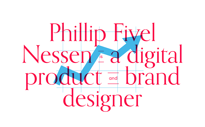
Phillip Fivel Nessen
Orpheus is a distinctive serif typeface that I have never seen used on the web before, even though it’s freely available to anyone with a Typekit plan. So kudos to Phillip Fivel Nessen for digging a little deeper and going with something that not everyone else is using. It definitely makes his brand stand out. The body type set in Sofia runs a little on the small side but it creates a dramatic contrast with the huge headline type.
Valio Con 2016
Playfair Display is one of the most popular Google Fonts but unfortunately I’ve seen it used way too often for setting body copy, which isn’t its intended use. Here on the Valio Con 2016 site, it’s used how it was intended to be used—for setting large display type. It pairs nicely with the body copy set in Texta, which feels kind of like a more quirky version of Avenir. Lodgecode, an uppercase-only sans with a distinctive R, is used for the buttons and large headers.
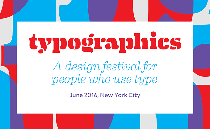
Typographics 2016
The heavy stencil cut of Eames Century Modern makes for an excellent branding typeface; it’s an extremely unique design that was inspired by the bent plywood furniture made famous by the design duo of Charles and Ray Eames. The letterforms are overlaid to create the colorful background image in the header. Mallory, the first release from Tobias Frere-Jones since his split from H&FJ, is paired with it for the body copy and navigation.
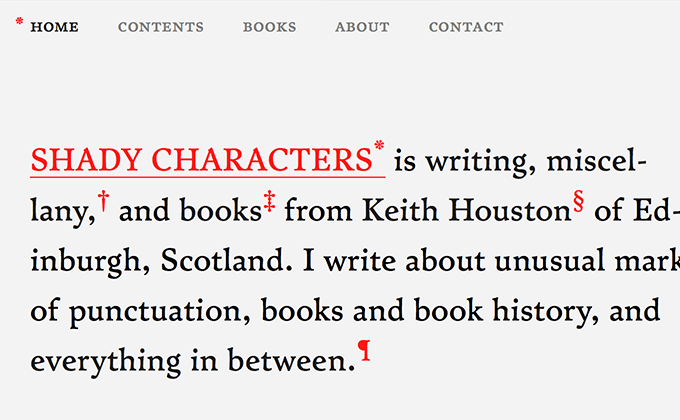
Shady Characters
Shady Characters is a website (and book) about the history of punctuation marks. The site was designed by the author, Keith Houston, who is actually a software developer by trade and not a designer. The site looks gorgeous though and the typography is flawless, which proves true the saying “web design is 95% typography.” The text is set in Satyr paired with its “unfaithful companion”, Faunus, used for headlines. The two typefaces both have a worn, organic look which perfectly complements the historical subject matter.
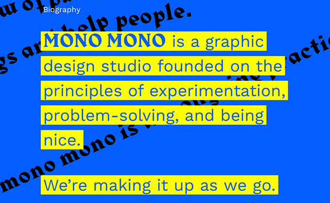
Mono Mono
I first came across the Mono Mono site posted on a forum where most of the comments were about how “unusable” the site is. And I have to agree that it is pretty hard to use. But it’s also interesting, engaging and doesn’t look like every other site out there. And it’s for a cutting-edge graphic design studio, not an insurance company, so the whole point is to stand out and do something different. The main font used is Harbour, which mixes elements from both blackletter and Latin type. Work Sans, a nice grotesque from Google Fonts, is used on the “info” page.
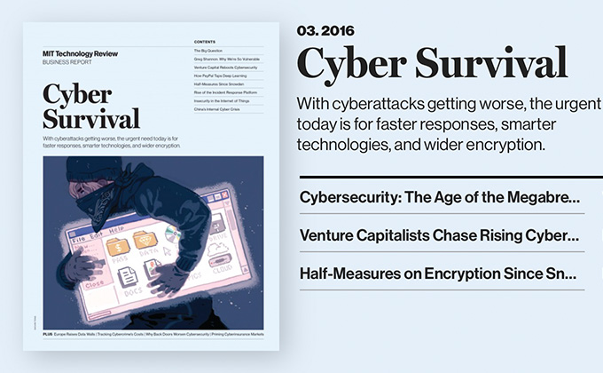
MIT Technology Review
The MIT Technology Review site was recently redesigned by Upstatement and they did an amazing job of creating consistency between the print and online version of the magazine. They could have just used Helvetica and Georgia, but instead went with Neue Haas Grotesk and Miller, which appears to be what is used in the print version. Georgia and Miller are actually very similar as they were both designed by Matthew Carter, but Georgia was designed for low-resolution screens and lacks the detail and refinement of Miller, which is especially noticeable on high-density displays. The text version of Miller is used for body text and the display version makes an appearance on the headlines in the “Business Reports” section. You can see how closely the type matches between online and print in the screenshot above.