This is the 37th installment of my monthly feature on Typewolf where I share my favorite type-driven websites from the previous month and then write a little about the typographic details behind the designs. You can check out last month’s post for January here.
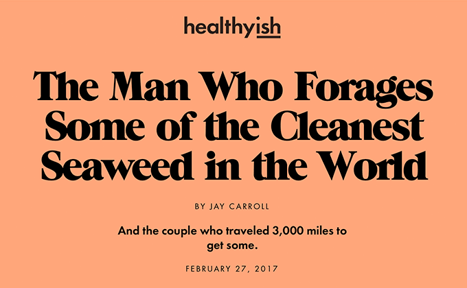
Healthyish
The Healthyish site combines two of the biggest trends in type at the moment—chunky, 1970s-evoking serifs and geometric sans-serifs. The fact that it’s used on a food/cooking site shows that this style is breaking through into the mainstream. ITC Grouch is set super tight with negative letterspacing—so tight that the letters are actually touching—which adds to that 1970s retro feel. Futura is paired with it while the open-source Crimson Text is used for body copy.
Typographics 2017
Each year, the site for the annual Typographics conference tries to do something unique with type and the latest iteration is no exception. Type Supply’s Ohm is set flickering and flashing to play off the typeface’s neon sign concept. One interesting thing about the site is that the headers set in Ohm swap out to a “dotted” style of Graphik on smaller screens, presumably because it’s easier to read when set small, yet still works with the flashing sign concept.
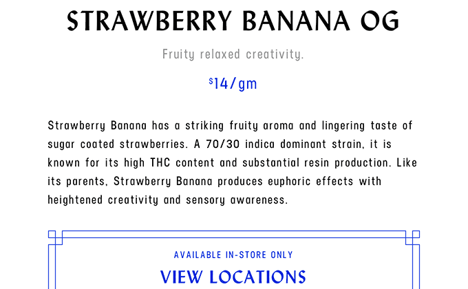
Serra (NSFW)
For a company that specializes in pot and pot accessories, Serra has surprisingly classy branding. The calligraphic sans Lydian is set entirely in uppercase and the geometric sans Neusa pairs very nicely with it as both share similar condensed proportions. However, Neusa is also used for body text where it doesn’t work quite as well—the body text inherits the letterspacing from the uppercase styles and feels a little awkward to read due to the wide spacing.
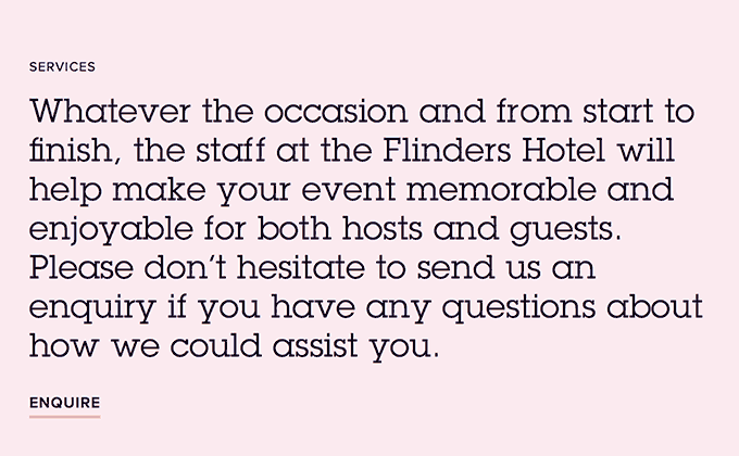
Flinders Hotel
ITC Lubalin Graph is a fairly popular slab serif font in the print world but this is the first time I’ve seen it used on the web. The design is essentially the same as ITC Avant Garde Gothic but with added slab serifs, so it pairs well with other geometric sans-serifs like Proxima Nova. This is another site this month that makes the typographic faux pas of letterspacing lowercase text—the small paragraphs of Proxima Nova look like they are inheriting the letterspaced styles from the uppercase. Uppercase type usually reads better with increased letterspacing but lowercase type almost never does.
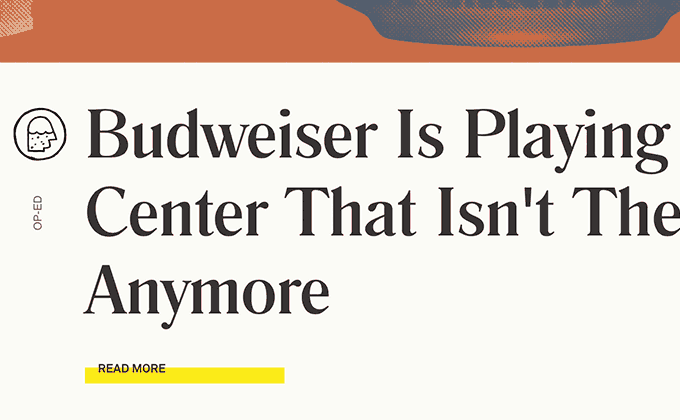
October
October is a new spinoff of Pitchfork that focuses on beer culture rather than music. It was developed by the same creative team behind Pitchfork, which shows, as it definitely shares a related aesthetic with previous projects of theirs. The serif Romana is used for headlines (which is the same font I use for the Typewolf logo) and the body text is set in Akkurat. Overall, I really love the type, but this wouldn’t be Typewolf if I didn’t point out the improper apostrophes used in the headlines, which you can see in the screenshot above.
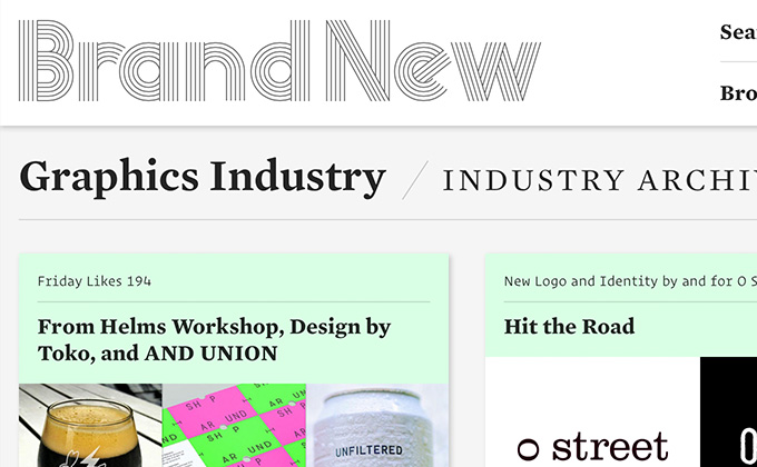
Brand New
I first saw the Brand New redesign mentioned on Designer News, where the almost universal reaction was negative. I was kind of surprised because I really dig the new look—I think they did something bold and unconventional with the type, and a site that is entirely about branding should have a strong brand.
I love the use of H&Co’s Operator—it’s a humanist design that was inspired by typewriter fonts but is actually proportional rather than fixed width. It’s such an unusual font that it will really contrast with anything, but here they are pairing it with Mercury, a classic serif from the H&Co catalog. I would have loved to see the italic styles of Operator used, as they take on a quirky cursive form which is rare for typewriter-inspired fonts. But the type here is probably distinctive enough as is. I applaud Armin and Bryony for doing something different and not just slapping a geometric sans on the site and calling it a day.