This is the 48th installment of my monthly feature on Typewolf where I share my favorite type-driven websites from the previous month and then write a little about the typographic details behind the designs. You can check out last month’s post for December here.
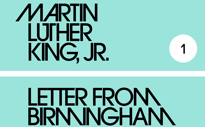
Penguin Modern
The Penguin Modern book covers are probably the single best use I’ve ever seen of ITC Avant Garde Gothic’s extensive ligatures. The typesetting really shows off some of the more exuberant letter combinations and everything lines up in such a typographically pleasing way. This level of exact typographic control would be difficult to accomplish using pure CSS, so it looks like this was integrated using SVG images rather than text.
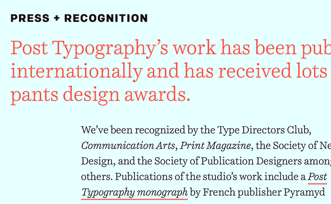
Post Typography
A design studio with typography in their name better have type that is on point and these guys certainly do. I really dig the typographic grid on the about page—the body text is offset from the headline with an indent, which helps keep the line length readable while also giving the layout a more dynamic feel. The headlines and body copy are set in Okay Type’s serif Harriet, with prominent use of the beautiful italic cut, while the subheaders are set with Process Type’s sans-serif Colfax in letterspaced all-caps. This type system is used consistently throughout the site, giving the design a cohesive feel.
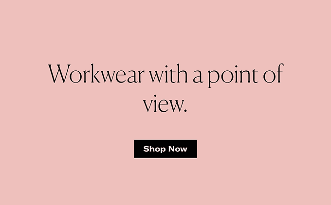
Grayes
Canela and GT America are probably the two hottest typefaces from 2017, but their use here comes across as classy and professional rather than trendy. Canela feels inherently fashionable, especially in the lighter weights, with its subtle, delicately flared serifs.
The screenshot above shows an awkward line break with a single word floating by itself that could have been prevented with a simple trick: manually add a <br> tag between a and point. This would balance out the two lines of text and would read much better. With dynamic content spit out of a CMS this isn’t always feasible to implement, but it could be worth training writers on the client-side to watch out for weird line wraps like this.
Bond
This is the first use of Basic Sans I’ve featured on Typewolf, which is surprising as it’s a trendy-looking grotesque that is available to anyone with a Typekit plan. It’s paired here with Schick Toikka’s calligraphic sans-serif Chap. Combining two sans-serifs isn’t usually recommended, but these two are different enough from each other to create sufficient contrast. The layout is built entirely around Lisa Tegtmeier’s gorgeous illustrations, with the color of the type matching up perfectly with the bold colors from the artwork.