This is the 41st installment of my monthly feature on Typewolf where I share my favorite type-driven websites from the previous month and then write a little about the typographic details behind the designs. You can check out last month’s post for May here.
Pavel Kedich
Morion is a quirky serif that combines razor-sharp terminals with a decorative Art Nouveau influence. It’s paired here with the sans-serif Fabrik, used in navigation and captions, which adds a contemporary touch to the design. The typographic grid on this site is unique in that the headlines are aligned with the paragraph indent rather than flush left. This helps break up the grid and makes the layout feel a little more dynamic and engaging.
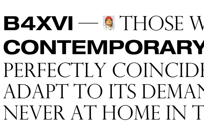
B4XVI
Using extended widths of typefaces is starting to become a hallmark of the brutalist design trend. Here, an extended cut of Helvetica Neue is mixed mid-sentence with Perpetua Titling. The cap heights of both typefaces match up nicely, so the effect isn’t too jarring.
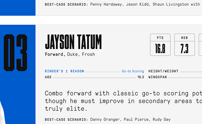
The Ringer’s 2017 NBA Draft Guide
Timmons NY is a condensed sans-serif that features angular corners in place of curves. This style of typeface always gives off a sporty, athletic vibe—the lack of curves feels masculine and the condensed proportions would make a last name fit well on the back of a jersey. So it’s definitely an appropriate typeface choice for this NBA draft guide. The tall and narrow structure of the letterforms makes reading difficult, so the typeface is used sparingly with GT Pressura Mono making up the bulk of the text on the site.
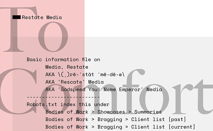
Restate Media
I love this effect of combining two contrasting styles of design. Space Mono feels futuristic, with the dashed line dividers further adding to the techy, computer terminal aesthetic. Caslon feels classy and refined. Together these two styles create a dissonance that feels right at home with the sarcastic tone of the site’s copy.
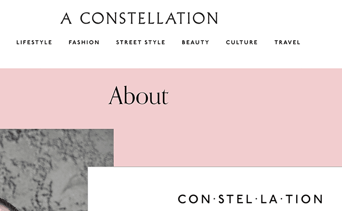
A Constellation
Orpheus is a serif typeface available on Typekit that sees little use compared to other more popular serifs on the service. It makes for a distinctive headline face on this style blog. It’s paired with Garamond for body text and P22 Underground for navigational elements.
Almost all of the type on this site is center aligned, which originates with the logo (set in Albertus). Once you decide to center align a logo, then it feels natural to center align the navigation as well. Then headlines start to look better centered. And on and on, all the way down the page. Fortunately, the centering stops with the body text in the longer articles, which switches to a standard flush left setting. Centered text looks elegant but can become tiresome to read when used in longer form content. I think this site strikes a nice balance.