This is the 50th installment of my monthly feature on Typewolf where I share my favorite type-driven websites from the previous month and then write a little about the typographic details behind the designs. You can check out last month’s post for February here.
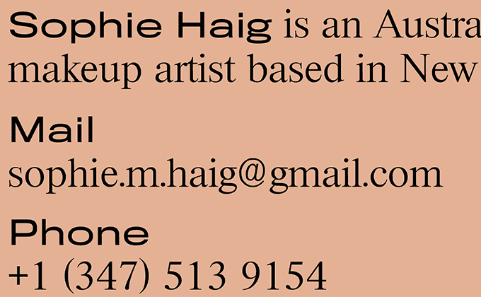
Sophie Haig
I thought this was Times New Roman at first, but it’s actually Riccione, a design that is super similar to Times but with wider proportions and thinner, sharper serifs. They could have saved a webfont download by just using the default system font instead. However, it does add a slightly different feel to the design, so maybe it is indeed worth the extra bandwidth. A wide cut of Titling Gothic is paired with the serif, adding a contemporary touch to the layout.
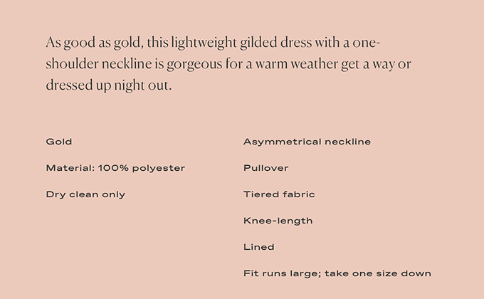
11 Honoré
Canela continues to be wildly popular with fashion brands—it’s beginning to feel like the twenty-first century version of Optima. Size-inclusive clothing company 11 Honoré make use of the lighter cuts here for their logo and site design.
Some of the type is a little on the small size, particularly the thin weights of Canela, which feature delicate strokes that can become brittle if used at too tiny of a size. Smaller type tends to look more elegant though, especially when contrasted next to a larger heading. An expanded cut of Favorit is used at sizes as small as 9px, but it holds up decently due to its sturdy strokes and wide letterforms.
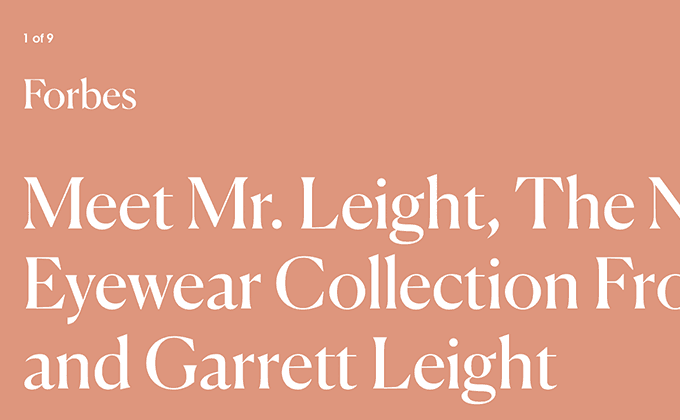
Mr. Leight
This is another site using the fashionable Canela, but this time a heavier, less-delicate cut is used. The logo looks to be loosely based on Canela as well, but with some strokes erased and triangular shapes tacked on. ITC Avant Garde Gothic is paired with it, used at a tiny size for maximum contrast with the large headlines.
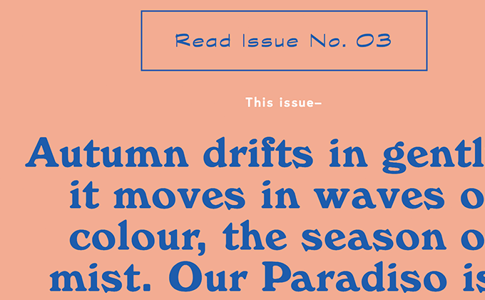
Paradiso
So we are four-for-four this month on designs using the trendy peachy-pink color. I’m not sure if I specifically seek out this color to feature or if it’s just too popular as to become unavoidable. But hey, it’s a nice color and much more interesting than the default black text on a white background…
The Paradiso site is all over the place with its type choices. Windsor gives off a laid-back 70s vibe. Europa feels sleek and modern, but it’s set with generous letterspacing, which gives the geometric sans a more open and friendly feel. The use of Optima adds a refined, classy touch. And Graphite, an upright script face based off an architect’s pencil, seems to be scrawled randomly throughout just for fun. It’s a lot of type to take in, but it makes the entire design engaging and full of personality.