This is the 52nd installment of my monthly feature on Typewolf where I share my favorite type-driven websites from the previous month and then write a little about the typographic details behind the designs. You can check out last month’s post for April here.
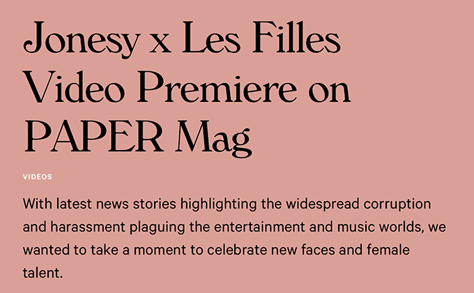
Jonesy
The 1970s-evoking Windsor typeface continues to be popular here on Typewolf. It gives off a warm, vintage aesthetic which feels like a perfect fit for a brand selling high-waisted underwear. The serif Plantin is used for the text set at smaller sizes where Windsor might be a little too ornate for optimal legibility. Calibre, a geometric sans from Klim, is paired with the two serifs, making the overall design feel a touch more modern and contemporary.
Cup of Couple
The Cup of Couple site uses four type families, but it doesn’t feel like too many as each typeface is used in a consistent way for a specific purpose. Displace, a high-contrast calligraphic sans, is used for the page headers. The article headlines use Perpetua Titling, a display cut of Perpetua that is available in uppercase only. Franklin Gothic is used for navigation and the body text is set in Garamond. Everything except the body copy is set entirely in uppercase which creates even more contrast between the text areas.
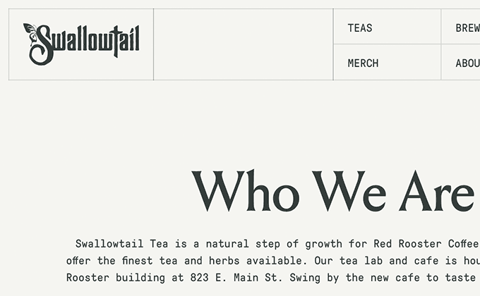
Swallowtail Tea
Louize Display is an inscriptional typeface from French foundry 205TF that is somewhat similar in style to the ultra trendy Canela from Commercial Type. It isn’t used nearly as much though, so it feels a bit more fresh and distinctive. The monospaced cut of GT Pressura is an unusual pairing choice as it feels more techie and industrial compared to the classical look of Louize, but I think it still works nicely.
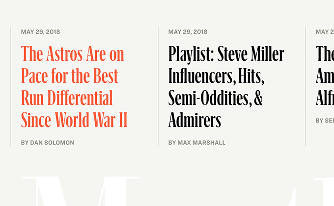
Texas Monthly
Condensed typefaces make for excellent headline choices as they allow for a larger font size while fitting more words per line compared to a standard-width face. The end result is a more efficient use of space with less awkward line breaks. The Texas Monthly site uses Grifinito, a compressed member of R-Typography’s Grifo family, for the main titles with the regular width used for the smaller headers. Hoefler & Co.’s Ringside and Chronicle Text round out the design, used as workhorse faces for navigation and body text.