This is the 34th installment of my monthly feature on Typewolf where I share my favorite type-driven websites from the previous month and then write a little about the typographic details behind the designs. You can check out last month’s post for October here.
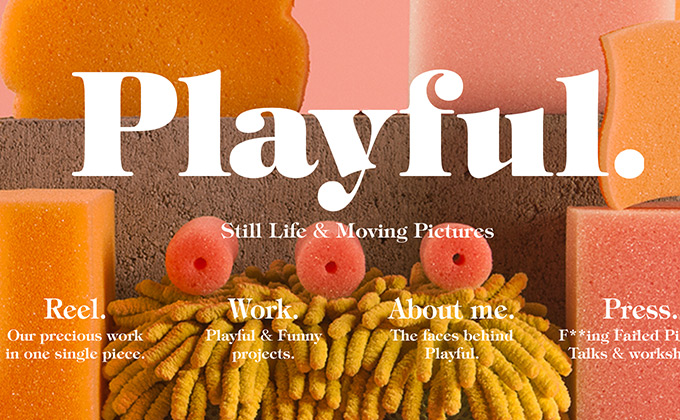
Playful
I almost didn’t feature this site on Typewolf because the site’s typography ranges from borderline unreadable to completely unreadable due to the fact that all the type is set on top of photos. That being said, I still really love this design. I think it could be argued that the bold, colorful photography is meant to overpower the type, as that is what this agency specializes in. Either way, it makes a huge visual impact. Ed Benguiat’s gorgeous ITC Tiffany is used throughout in medium and heavy weights.
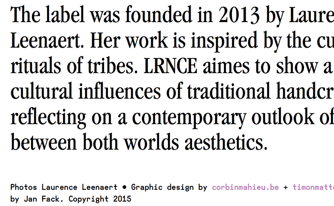
LRNCE
I’ve noticed that the condensed cuts of Garamond have been making a bit of a comeback lately. Before switching over to Myriad in the early 2000s, Apple had been using a customized version of Garamond condensed as their main branding face since the early 1980s. I think this gives the typeface a retro charm that is appealing to designers who fondly recall the vintage Apple ads. This site definitely evokes that retro feeling, while the addition of Radim Peško’s Fugue Mono adds a modern touch to the design.
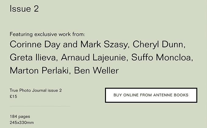
True Photo Journal
Folio is a neo-grotesque that was released at the same time as Helvetica and Univers but never quite reached the same level of success. It’s used as the sole typeface on the True Photo Journal site, where it immediately appears distinctive from the overused Helvetica—the x-height is smaller and the letterforms are less even, which gives the typeface a slightly quirky feel that is more akin to the early grotesques that predated Helvetica.
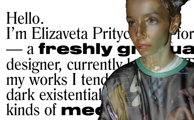
Leeza Pritychenko
Leeza Pritychenko’s site could probably be classified as brutalist—it looks intentionally raw and unpolished. The use of Nimbus Sans mixed mid-sentence with Romana looks harsh, but the x-heights actually match up pretty well and the copy is set with proper apostrophes and dashes, so the typography really isn’t all that brutal. This whole aesthetic may turn some people off, but the design is unique and about as far from a Bootstrap template as possible.
Sam Dallyn
Akkurat is a sans-serif from Lineto that feels like a mix between DIN and Helvetica—the letter shapes are uniform but the tail on the lowercase l and the double-story g make it feel less static compared to typical geometric sans and neo-grotesque designs. Likewise, Sam Dallyn’s site is clean and stark but features a creative use of a grid that zigzags down the page, which gives it a similar dynamic quality. The paragraphs on the about page are set with indents rather than line breaks, which adds a more print-like feel to the layout.
Kinfolk
The recent Kinfolk redesign utilizes two contemporary typefaces from Klim Type Foundry—Domaine Text and Feijoa—combined with a classic Futura-inspired geometric sans, Twentieth Century. Domaine Text is the same typeface I use for body text on Typewolf, but on the Kinfolk site it is used as a display face for headlines rather than as a text face. For a text face, it still has quite a bit of character when set at large sizes. The type on the article pages is set well with a narrow line length that is easy to read, recalling a magazine layout more so than a typical online article.