This is the 45th installment of my monthly feature on Typewolf where I share my favorite type-driven websites from the previous month and then write a little about the typographic details behind the designs. You can check out last month’s post for September here.
Taylor Franklin
This is the first use of Louize I’ve featured on Typewolf, but I’m sure we will see more of it in the future. It’s a beautiful typeface with an inscriptional quality similar to the ultra-popular Canela. The display version is used here which shows off some of the distinctive quirks of the face such as the diamond-shaped dots on the letter i and the unusual a with its small bowl and wide aperture.
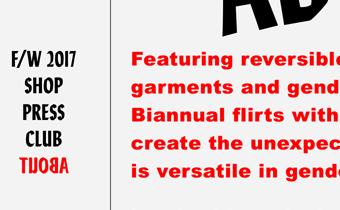
Biannual
A common logo design technique I’ve noticed lately is setting the brand name in a font and then artificially skewing it to the left, almost like a reverse italic. It’s a quick way to give type a weird, offbeat appearance. Biannual uses that trick here for their logo set in Lydia. Lydia is a contemporary interpretation of Lydian, a calligraphic sans from 1938, but with more condensed proportions. It’s combined here with Arial Black, which when used at large sizes like this, actually looks quite a bit different than Helvetica—notice how the terminals are angled rather than straight like in Helvetica.
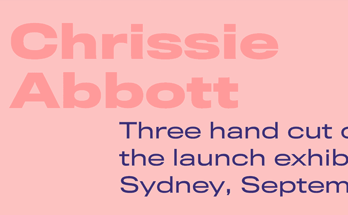
Chrissie Abbott
This is the style of designer portfolio site that Dropbox seemingly drew inspiration from for their recent redesign (see below), with its colored text set in an extended grotesque on top of a colored background. However, in this case the design feels much more appropriate as the harsh colors perfectly match the style of work in the designer’s portfolio. This type of aesthetic isn’t for everyone, but I’m sure it attracts the type of clients the designer wants, which is the whole point of a portfolio. The grotesque used here, Titling Gothic, has been around since 2005, so it’s a bit older than some of the other wide-bodied grotesques that have been popular with designers lately like GT America, Druk and Sharp Grotesk.
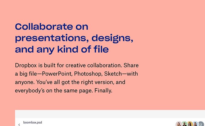
Dropbox
My eyes hurt seemed to be the typical response to the new Dropbox redesign. People either love the colored-text-on-a-colored-background look or hate it with a passion. I personally dig the new look, but I can understand the negative reaction—it’s a strange aesthetic for a cloud storage service. It feels more like a trendy designer portfolio site (see above) than a tech company. But at least it doesn’t look like a Stripe knockoff with zero personality like almost every other Silicon Valley startup. The unconventional look makes Dropbox stand out from their competitors and it got people talking, so it is a successful design in that regard.
As far as the type, this is the question I had: if their new brand typeface, Sharp Grotesk, is as versatile as touted with its 259 individual styles, then why is the body text set in Atlas Grotesk, an entirely different sans-serif family? My guess is that the woodtype-inspired Sharp Grotesk just had too much personality and quirks when used at text sizes, leading the designers to go with something a little more conservative for the body copy.