This is the 20th installment of my monthly feature on Typewolf where I share my favorite type-driven websites from the previous month and then write a little about the typographic details behind the designs. You can check out last month’s post for August here.
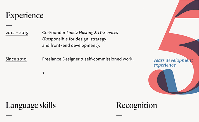
Johannes Mutter
Hoefler & Co.‘s Quarto and Ideal Sans make for a beautiful combination on Johannes Mutter’s site. Old Style serifs paired with humanist sans-serifs almost always look great together and this case is no exception. The type on the about page is set particularly well—the overlay effect on the “3” and “5” adds a nice touch of warmth and personality to the resume section, which otherwise might have felt a little sterile.
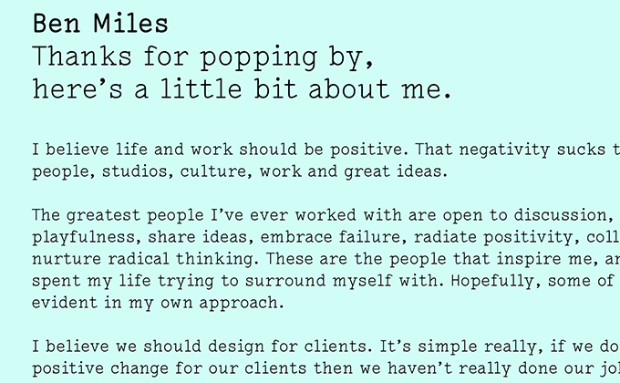
Ben Miles
Lacrima is a typewriter-inspired typeface from Milieu Grotesque that immediately feels much more distinctive than other typewriter faces such as Courier. Despite its unique design, it still remains surprisingly legible as a body face. It’s paired here with Platform, a geometric sans-serif from Commercial Type. The two column layout for the content helps keeps the body text at a comfortable line length for reading.
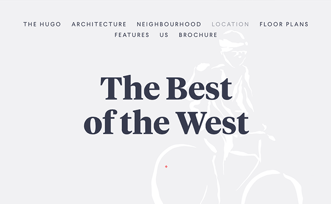
The Hugo
Tiempos Headline is a high contrast serif with tight spacing so it really shines when set at larger sizes like on this site. Larsseit, a grotesque from Type Dynamic, is used for body copy as well as navigation and captions where it is set in letterspaced uppercase, giving it an elegant feel. All of the type on this site is center aligned, which in most cases makes for poor readability, however, with the minimal amount of body copy here I think it works just fine.
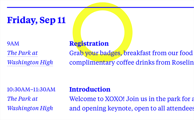
XOXO Festival
Tiempos Text, compared to Tiempos Headline used in the site above, has less contrast and slightly looser spacing so it excels as a text face. The XOXO Festival site uses it as its sole typeface, mixing in the bold and italic styles to create contrast, rather than introducing a second typeface into the design.
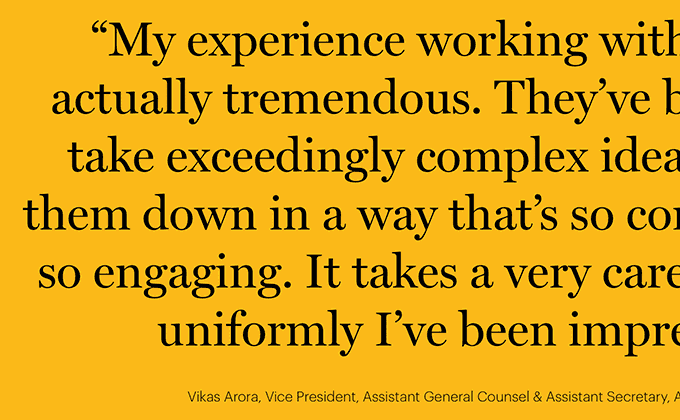
Baker
Graphik, a grotesque from Commercial Type, contrasts nicely with the two Scotch Roman serifs used here, Miller and Georgia. The testimonials on the homepage use proper quotation marks, apostrophes and dashes, which are absolutely crucial when setting large type like this. The “pro” version of Georgia contains additional weights not available in the standard system font version, and here the light weight is used to set the body copy. Using a light weight of any font for body copy can oftentimes be risky—although it looks fine on my Retina display, some displays don’t render the thin letterforms as well which can hinder legibility.
We Heart
The body text on this site takes a unique approach by mixing two typefaces together mid sentence—the copy is set in Futura but when italics are called for, the typeface changes to Freight Big. I think it’s an interesting idea as the italics of geometric sans-serifs (obliques in this case) usually don’t provide enough contrast to truly emphasize something as do true italics like those found in serif faces. So it has a functional as well as an aesthetic purpose, although I think it would have been nice to see Freight Big used throughout the site in other places a bit more to help tie it back into the design. The monospaced Letter Gothic is used for navigation, dates and captions.
Garbett Design
This site uses two typefaces from Grilli Type that couldn’t be more opposite—GT Walsheim and GT Sectra. GT Walsheim is based on precise, geometric forms while GT Sectra is a calligraphic design that is derived from a human hand holding a pen. Together they create a contrast that makes the design feel unique and engaging. The body text is set well with proper apostrophes and the two column layout keeps the paragraphs set at a readable measure.
Best Made Company
Filosofia is a beautiful typeface from Emigre that has been extremely popular in the print world since the late 1990s but this is the first time I’ve seen it used on the web. The design is an interpretation of Bodoni but one with less contrast to make it work as a body text face. It looks wonderful on the Best Made Company site paired with Tobias Frere-Jones’ Interstate. As much as I love the type on this site, I have to call out the straight quote in the screenshot above which should instead be using a proper apostrophe.
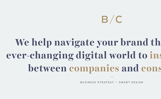
B&C Designers
Harriet is a serif type family from Okay Type that is available in a huge selection of display and text styles. The high-contrast, bold display style is used here and works nicely with Revisal, a humanist sans-serif from Type Dynamic. This is my first time encountering Revisal and I think it’s unique for a humanist design, looking a bit more clean and geometric than most. There are a lot of humanist sans-serifs on Google Fonts that are starting to feel a little overused (such as Lato and Open Sans), so kudos to B/C for going with something a little more distinctive and less-used.
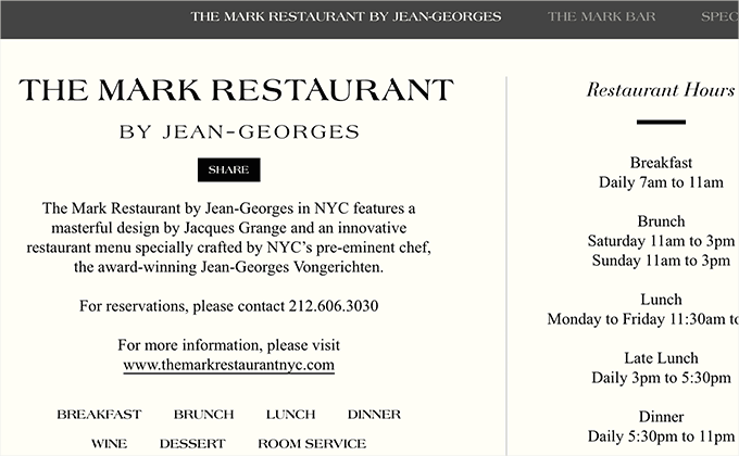
The Mark
The Mark is a sophisticated, upscale NYC hotel and the type on their site perfectly complements that image by using three classy serif typefaces—Americana, Bodoni and Times New Roman. I think it’s interesting that the logo shown on the site looks to be using a customized version of Americana while the logo shown on the front of the building in the photo looks to be using just straight up, non-customized Americana. The body text is set in Times New Roman, a typeface that is much-maligned due to it being a default system font. I think on this site it is actually a great choice as it feels right at home with the site’s typographic aesthetic and works well as a readable body face unlike Americana or Bodoni which are both more suitable for display usage.