I first encountered TEFF Lexicon when type designer Kris Sowersby chose it as one of his top three favorites typefaces. Having never heard of Lexicon or TEFF (the foundry that released Lexicon), I decided to do a bit of Googling around. I discovered a very beautiful typeface, but was a bit taken aback by the price—$391 for a single cut or $4,996 for the complete family.
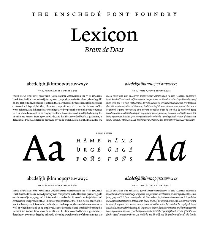
Lexicon sample sheet. Source: teff.nl.
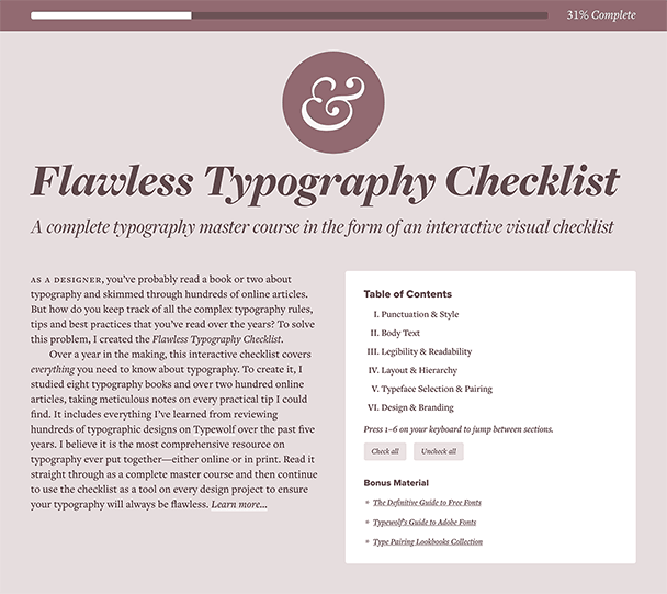
How Much Should a Typeface Cost?
The easy answer is a typeface should cost however much someone is willing to pay for it. The value the customer gets from it should determine the price. However, pricing can be much more complicated than that.
Ten Dollar Fonts price their fonts cheaply with the hopes of making their products more accessible to the masses (and hopefully getting more sales). With Lexicon, TEFF takes the exact opposite approach—they would rather get fewer sales and deal exclusively with customers who place an extremely high value on quality typefaces.
People might accuse Ten Dollar Fonts of driving down the value of typefaces by setting their prices so low. In reality, I think it is just a completely different market they are serving. Someone creating a project for fun isn’t going to spend thousands of dollars on a typeface, just like a book publisher isn’t going to expect to spend $10 on the typeface for their book. Lexicon took three years to design. I don’t think anyone would spend three years designing a typeface and then sell it for $10.
I actually did a little research and was able to find a font that is slightly more expensive than Lexicon. It’s called JHA Bodoni Ritalic and is available on MyFonts for an even $5,000. Type designers selling their fonts through MyFonts can price them however they want though. This may very well be a nice typeface, but I’d be genuinely surprised if anyone has ever actually purchased this single cut for $5,000. And if someone has, then the designer, Jan Henrik Arnold, is not only a great type designer but a brilliant marketer as well.
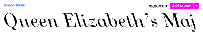
Priced at $5,000 for a single cut, JHA Bodoni Ritalic is actually a more expensive font than Lexicon.
The “Type Designer’s Typeface”
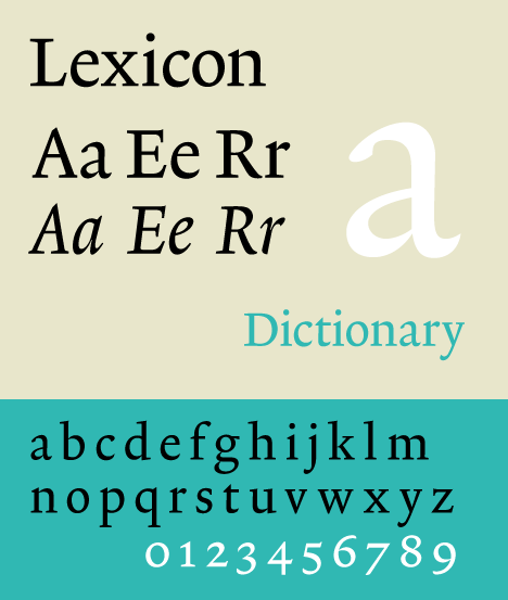
Lexicon was designed by Dutch type designer Bram de Does. Although De Does only designed two typefaces in his career, he is still considered a master craftsman of his trade. His first typeface, Trinité, was released in 1982. After Trinité, De Does claimed there would be no new typefaces ever again from his hand. Fortunately, De Does had a change of heart. In 1989, he was approached by the designer of Van Dale’s Dictionary of the Dutch Language who wanted to use Trinité at a tiny point size for the dictionary. Instead, De Does suggested designing an entirely new typeface. That typeface eventually became Lexicon.
Yet its reputation belies its fame among designers, perhaps because of its high price, but perhaps also because of its nuanced perfection, which perhaps makes it—like the obscure ‘musicians’ musician’, the archetypal ‘type designer's type design.’Eye Magazine article about Lexicon
Lexicon specimen. Source: Wikipedia.
Lexicon is available in two versions, Lexicon No. 1 and Lexicon No. 2. Lexicon No. 1 has short ascenders and descenders which makes it suitable for use at very small point sizes (like in a dictionary). Lexicon No. 2 has ascenders and descenders of a more regular length which makes it suitable for more general purposes.
In addition to still being used by Van Dale’s dictionary, the Dutch newspaper NRC Handelsblad (considered the New York Times of the Netherlands) used Lexicon between 2001 and 2013. There are several bibles that are set with Lexicon as well.
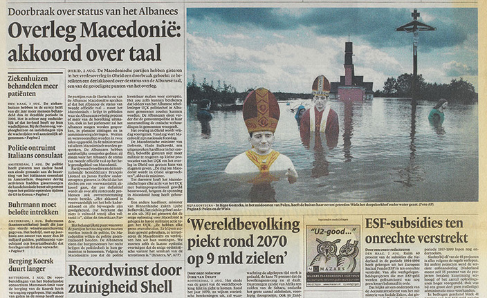
Lexicon in use in the NRC Handelsblad newspaper. Source: eyemagazine.com.
So Who Would Pay $4,996 for a Typeface?
Would I personally ever pay $4,996 for a typeface? Probably not. However, if I had a large client with the budget for it and Lexicon was the perfect fit, then I would purchase it in a heartbeat (assuming I could convince the client of its value). To a company that spends millions of dollars per year on marketing, dropping five grand on a typeface really isn’t that much.
So next time you have a client with a little extra money in their budget, go buy Lexicon! Show your clients the value of great type. And if you are a type designer, then you can thank Lexicon for keeping the prices of typefaces up.
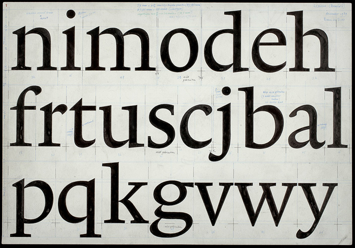
Original drawing of Lexicon. Source: bijzonderecollecties.uva.nl.
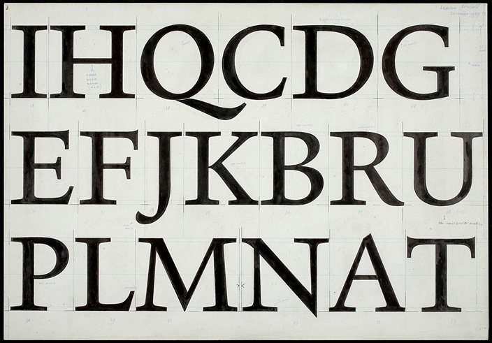
Original drawing of Lexicon. Source: bijzonderecollecties.uva.nl.
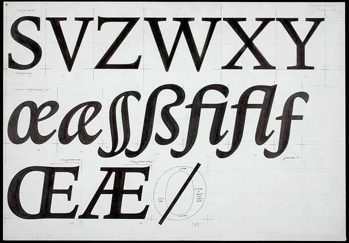
Original drawing of Lexicon. Source: bijzonderecollecties.uva.nl.