This is the 46th installment of my monthly feature on Typewolf where I share my favorite type-driven websites from the previous month and then write a little about the typographic details behind the designs. You can check out last month’s post for October here.
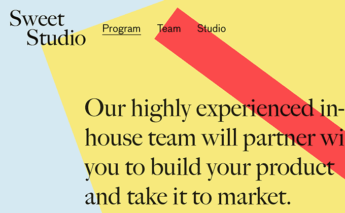
Sweet Studio
Big Caslon, a Caslon revival from Matthew Carter, was inspired by the display faces of William Caslon and is intended for use at large sizes only due to its high stroke contrast. It’s used for headlines here paired with the grotesque FF Bau for body copy. The logo text is offset at an angle onto two lines, which plays off the angular, rotating shapes used throughout the rest of the design.
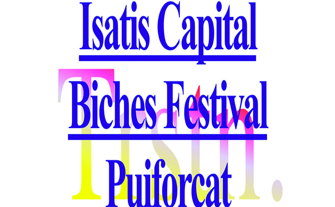
Trstn
Times New Roman is available in condensed styles, but that isn’t what is used here. Instead, this site breaks one of the traditional rules of typography: don’t artificially distort type. The Times font used here is simply the default system font, set in bold with negative letterspacing and then stretched with CSS using scaleY. The use of Arial is distorted as well, this time being squished down. The letters look completely unnatural and deformed, but I thought it was an interesting technique to get a unique look using only system fonts.
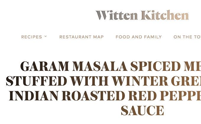
Witten Kitchen
Apart from the body text set in FF Mark, nearly all of the type on this site is set in uppercase. It’s common to see uppercase text used for navigation, however, setting headlines in uppercase is more rare, as it can make reading more difficult. In this case, I think the headlines are short enough to get away with this treatment without impacting the readability too much. The uppercase headlines also create a nice rectangular shape that makes the gradient overlay effect on the text more prominent, which is a key part of the site’s branding, as it mirrors the gradient in the logo. The distinctive logo is using Commercial Type’s gorgeous Dala Prisma face, while the headlines are using Austin, also from Commercial Type.
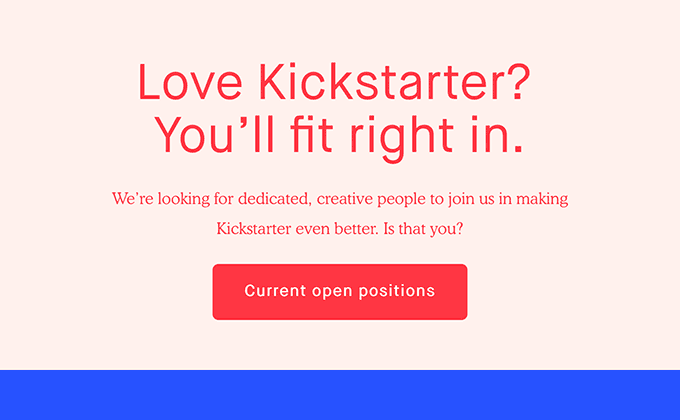
Kickstarter
My first impression of the Kickstarter redesign was that it was a little bland. The homepage is pretty much stark black-and-white and the font sizes are uniformly small, which doesn’t give any real hierarchy to the content or convey any sense of personality. Clicking around the site, though, I discovered there is more interesting design within.
The interior pages, such as the About and Jobs pages, have much more character with their bold use of color and large type. The body text is set in Cooper, a type family that recalls graphic design of the 1970s. Cooper is famous for its bubbly black weight, however, the light weight is used here, giving the design a warm, slightly retro feel. Maison Neue, a trendy sans from Milieu Grotesque, is paired with Cooper, adding a more contemporary touch.
On a technical note, only a single style of Maison Neue and Cooper are loaded, which leads to numerous instances of faux bold and faux italic throughout the site. Faux bold tends to look blotchy and fuzzy, as you can see on the navigation of the interior pages. Loading just a single font style may save bandwidth, but it usually isn’t worth the potential tradeoff of poor type rendering.