This is the 21st installment of my monthly feature on Typewolf where I share my favorite type-driven websites from the previous month and then write a little about the typographic details behind the designs. You can check out last month’s post for September here.
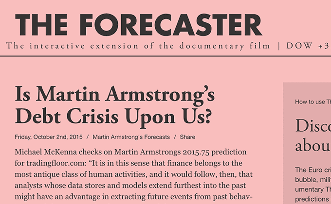
The Forecaster
The Forecaster site does an excellent job of evoking a classic newspaper with its use of Garamond and Alternate Gothic. The additional use of Helvetica Neue and Georgia, however, feels a little out of place with this aesthetic. The site is already loading the regular, bold and italic styles of Garamond so it may have made for a more cohesive design to just stick with Garamond throughout rather than introducing the second serif with Georgia. But other than that, the type on this site is really well done. The logo is set in uppercase bold Futura which feels like it can be paired with anything.
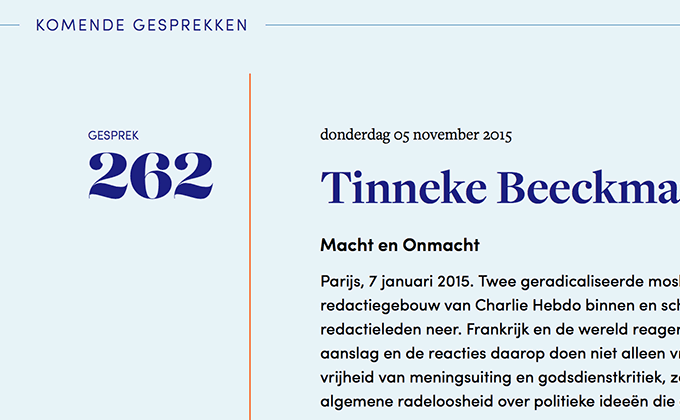
Brandtpunt
I love how the homepage of Brandtpunt is entirely type-driven without an image to be found. Freight Display and Freight Text are paired, showing you can’t go wrong using a superfamily. The large numbers are set in Lust, an ultra-curvy, high-contrast serif from Positype. The Freight superfamily actually includes an optical size that is even more high contrast than Freight Display, known as Freight Big, however, even its contrast pales in comparison to Lust’s. The Futura-esque Sofia is used for body text and subheaders.
Opera Philadelphia
I think it’s interesting how the body text on this site is set in Futura, rather than Caslon which is considered a classic book face. The Futura text actually reads pretty well though as it is set with generous line spacing. My only nitpick about this site is the few places where the type is overlaid on top of photos and becomes unreadable. This style of type treatment is always risky—it may look good in the designer’s comp, however, once the client starts adding their own photos, it can quickly fall apart.
Alldayeveryday
Friz Quadrata is a distinctive typeface that you probably recognize from its prominent use in the TV show Law & Order as well being used in the logos of a slew of punk rock bands including Bad Religion and Black Flag. It’s paired here with Brown, a popular geometric sans-serif from Lineto. The body text is actually set with slightly loose letterspacing and although it’s usually considered a bad practice to letterspace lowercase, in this case I think it adds a breezy, laid back aesthetic to the design.
No Divide
Something about Mark Simonson’s Grad typeface makes it beg to be tracked tightly. I used it on an old version of my portfolio and I remember setting it rather tightly similar to how it is on this site. The body text here is set justified which you don’t see too often on the web as it creates nice, even columns but comes at the expense of uneven word spacing. In this case, I think it still remains quite readable and adds a touch of elegance to the layout. FontFont’s FF Good Headline is used for the nav and headers.
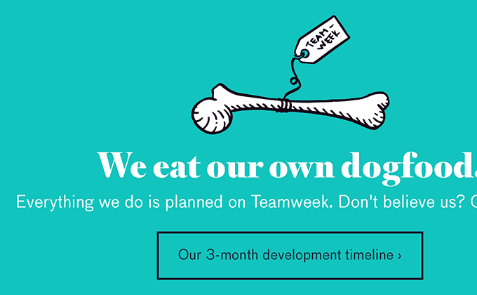
Teamweek
Chunky, high-contrast serifs are super popular at the moment, however, this heavy cut of Romain from Swiss Typefaces doesn’t seem to be used that much on the web. The same can be said for FF Bau—quirky grotesques like this are trendy right now but FF Bau is far from overused. So I applaud Teamweek for digging a bit deeper and pairing two typefaces that aren’t being used by every other site out there. I think it definitely helps to create a more distinct and memorable brand.
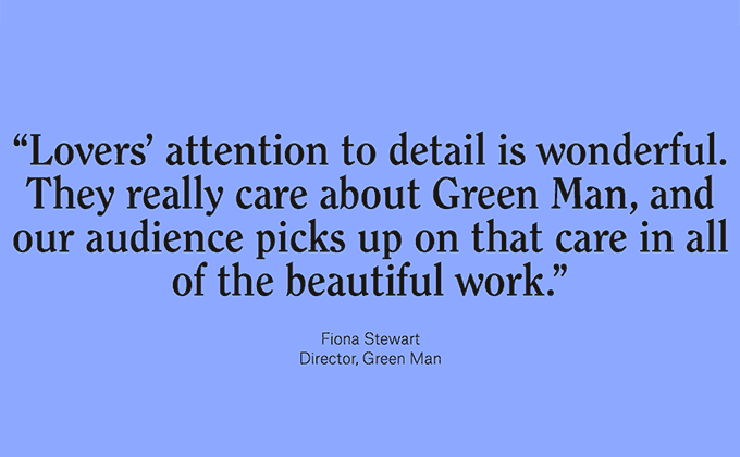
Lovers
ITC Clearface is a 1970s-evoking typeface that seems to be making a comeback as of late. It’s paired here with Atlas Grotesk, a fairly neutral neo-grotesque that balances well with the flamboyant nature of ITC Clearface. Props to the designers for correctly using smart quotes and apostrophes which you can see in the image above.
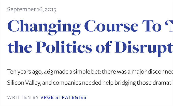
Vrge
This is another site that prominently features type set on top of photos, although on this site the designers have done an excellent job of darkening the photos to ensure adequate contrast for legibility. I’m surprised more sites don’t take this approach of pairing a serif and a sans-serif from the same superfamily—Freight Sans and Freight Big go together wonderfully as they share the same basic skeleton and have similar proportions.
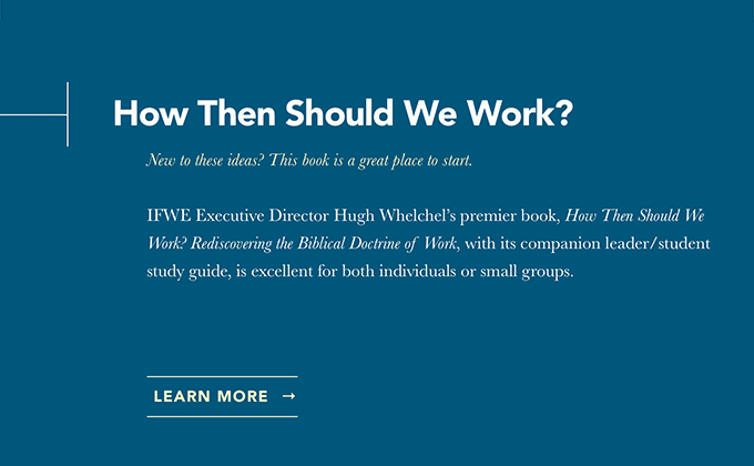
IFWE
I’ve always loved the italics of Baskerville—they contrast so much with the roman and are so ornate they almost feel like a swash style. The IFWE site makes prominent use of them which adds a graceful, sophisticated touch to the design. Avenir is set in bold and tracked tightly for the headers. Seeing it set like this reminds me of Gotham and Proxima Nova, which I’m sure Avenir was a big influence on.
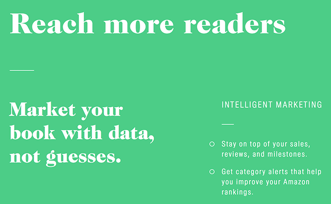
Pronoun
This is yet another site this month featuring a heavy, high-contrast serif which shows how popular they are becoming. Pronoun uses a black weight of Caslon for headers and a regular weight for body copy. Caslon is a classic book face (“When in doubt, go with Caslon”) so it’s an appropriate choice for a book publishing platform. A condensed cut of Suisse Int’l from Swiss Typefaces is used with generous letterspacing—often condensed sans-serifs can benefit from a small amount of added spacing.