This is the 13th installment of my monthly feature on Typewolf where I share my favorite type-driven websites from the previous month and then write a little about the typographic details behind the designs. You can check out last month’s post for January here.
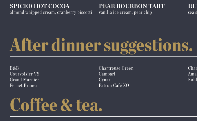
Charlie was a sinner
It’s usually not a good idea to rely on a display face for the single typeface on your site. Display typefaces, like Chronicle Display, are meant to be used at large sizes for headlines and are not intended for body copy. That being said, I think this site can get away with it—there is essentially no body copy and the text is set large enough to not cause any legibility issues with the high contrast typeface.
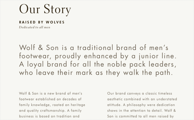
Wolf & Son
I think it is interesting to see Electra, a typeface traditionally used as a book face, being used essentially as a display face on this site. I think it looks great combined with Futura. The body copy type, set in Futura, runs a little on the small side but the narrow line length and ample line height definitely adds to the readability.
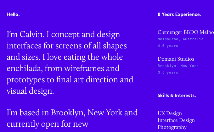
Calvin Teoh
I always thought Calluna was kind of quirky, for a serif text face at least, so I think it looks great paired with the quirky geometric, Brown. Maison Mono is added to the mix as well, used for tertiary text. Also I wanted to give props to Calvin for using proper apostrophes throughout the site.
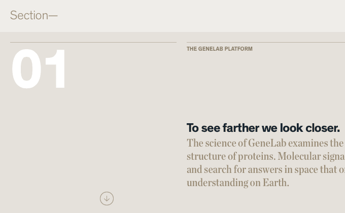
NASA GeneLab
There is a lot I like about this site, however, I have a lot of nitpicks as well. Overall, I love the general aesthetic of the design—it’s great to see a more distinctive grotesque like Theinhardt, rather than Helvetica. The Theinhardt plus Chronicle Display combo looks wonderful. That being said, I think a lot of the type on this site is just way too tiny. A high contrast face like Chronicle Display doesn’t hold up well at small sizes and the body copy is set rather small with a long line length which doesn’t make it very readable. I also think some of the small type set in uppercase Theinhardt would greatly benefit from some added letterspacing.
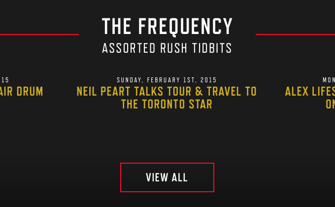
Rush
Rush is a band I hated growing up but recently rediscovered in adulthood and finally realized how brilliantly awesome their music is. I absorbed their entire catalog in a span of a few months. So I was stoked to see their site recently redesigned by Plank and Happy Cog. The geometric sans Refrigerator Deluxe, from Mark Simonson, is set entirely in uppercase and the contemporary serif FF Tisa is used for body copy.
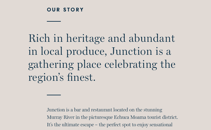
Junction Moama
This is yet another example this month of a site using a display face for setting body copy. Miller is a beautiful Scotch Roman designed by Matthew Carter that has both a text and a display version available, but this site is using only the display version. Ideally you would want to use the text version for body copy, but there is always the page load time trade-off with introducing additional fonts. I think in this case the display version is ok for the body copy—the text length is fairly minimal and a large enough font size is used to keep things legible. Neuzeit is used in the design as well, set mostly in uppercase.
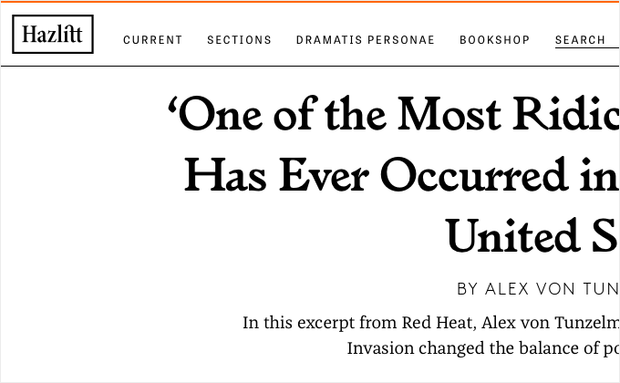
Hazlitt
Is four different typefaces too many to use on one site? In general, I’d say the answer is yes. However, what this site loses in type consistency, it makes up for with an engaging, interesting and lively design that begs to be explored. Brown and FF Franziska are the main typefaces used, with Brown being used for headlines and FF Franziska for body copy. Tablet Gothic is thrown in as well for sidebars and the nav. And then the serif Larish Alte make an appearance for the occasional headline. Using too many typefaces sometimes actually works.
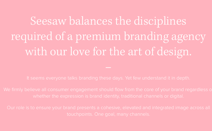
Seesaw
I really love the combo of the serif Kepler and the sans-serif Aktiv Grotesk, also known as the “Helvetica killer.” However, to me personally it feels weird adding in Proxima Nova as a secondary sans-serif for body copy. At small sizes it feels similar enough to Aktiv Grotesk but not different enough to add sufficient contrast. I’d be curious to know why they didn’t just stick with a single sans-serif throughout.
Studio Lovelock
This site uses Futura as the sole typeface and I’m glad they didn’t introduce a secondary typeface, as I think it would have ruined this whole aesthetic. I’ve noticed a trend of sites using a geometric sans-serif such as Futura for the primary display face and then using a secondary sans-serif for body copy. I think the reasoning is that geometric sans-serifs don’t make good text faces so therefore a secondary typeface is needed. The problem is that in most cases, good body copy sans-serifs, especially humanist sans, tend to clash horribly with geometric sans. If you only have small amounts of body copy then I think it is fine to just stick with a single geometric sans like this site does. If you have longer amounts of body copy then it’s usually better to introduce a serif typeface rather than another sans-serif.
The Hechinger Report
I love how this site makes prominent use of the italic style of National. The roman feels like a traditional grotesque but the italic has more of a flowing, humanist quality which adds warmth to the design. National was designed by Kris Sowersby and two more of his typefaces, Tiempos Headline and Tiempos Text, round out the design. A lot of times, using typefaces from the same type designer can add an underlying sense of consistency to a design.


