Over my 24-year career as a designer, I’ve amassed quite a nice collection of books on typography. Some have been more useful than others. In this article, I will share my thoughts on the books I’ve read, as well as gather together a list of books I’ve seen recommended elsewhere that I hope to read in the future.
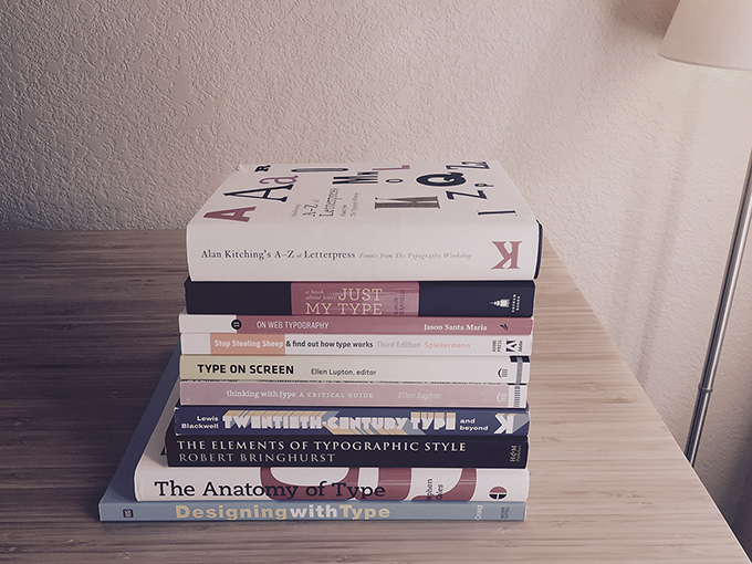
I will keep updating this collection as new typography books are released, and as I find the time to read the books that I haven’t gotten to yet. As an Amazon Associate, I earn from qualifying purchases.
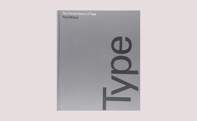
The Visual History of Type
By Paul McNeil · 672 Pages · 2017
This is my favorite type book that I own—yes, even more so than Bringhurst. It’s not about typography; it’s about typefaces. But it is a monumental work that showcases the evolution of type from the days of Gutenberg to modern times, and reading it will expose you to the entire history of typography and give you a new perspective on graphic design.
It’s a gorgeous book with full-color specimens and extensive details about each of the 320 typefaces it covers. The writing is fantastic and holds up well, even over such a massive volume. I can’t imagine the amount of time and effort that went into producing a work of this magnitude.
The Visual History of Type is a daunting read at 672 pages, but I was able to make it through the book by reading one spread every morning before I began the workday. It ended up taking me over a year to finish. If you only want to read one book about type, then skip this one and read Bringhurst’s book mentioned below. But if you are a lover of type, then this is an essential addition to your library.
View on Amazon →
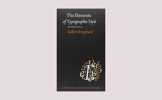
The Elements of Typographic Style
By Robert Bringhurst · 382 Pages · 1992 (Revised in 2012)
The Elements of Typographic Style has received universal acclaim and, yes, it is as good as everyone says it is. It will instill in you a passion for typography. If you are only going to read one book from this list, read this one.
That said, it’s not very visual, so if you are someone who needs full-color examples, then you might prefer some of the other selections below. The writing can also be a bit flowery and poetic at times (which makes sense considering Bringhurst is better known as a poet than a typographer), which may turn some people off.
There is a long chapter about page layout that focuses on book and magazine design, with detailed information about picas and columns and such. If you design for screens, you may not find that section very applicable. But other than that chapter, most of the content is timeless and could apply to any typographic medium.
View on Amazon →
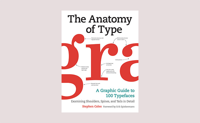
The Anatomy of Type
By Stephen Coles · 256 Pages · 2012
As opposed to Bringhurst’s seminal book above, Stephen Coles’ The Anatomy of Type (published as The Geometry of Type in the UK) is primarily a visual work. It closely examines 100 typefaces, zooming in on the tiny details that make up the designs.
There is a section at the beginning that covers typeface classification. This was my favorite part of the book and what I found to be the most useful. The rest of the book begins to feel tedious after a while as the same design features are called out over and over again (large x-height, open apertures, mild bracketing, etc). But after reading this book, you will be better at identifying and classifying typefaces as these little details seep into your brain. This, in turn, will make you better at communicating about type.
View on Amazon →
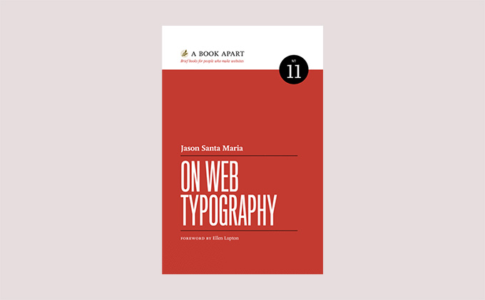
On Web Typography
By Jason Santa Maria · 142 Pages · 2014
Designer Jason Santa Maria’s book is one of the shortest books about typography that I own but also one of my favorites. It features a nice overview of the basics and also includes some new ideas that I hadn’t read about in other books. The How We Read section is particularly good and is even available to read for free online. If you design for the web and want a short, easy-to-read book that still covers a lot of ground, then this is my recommendation.
View on A Book Apart →
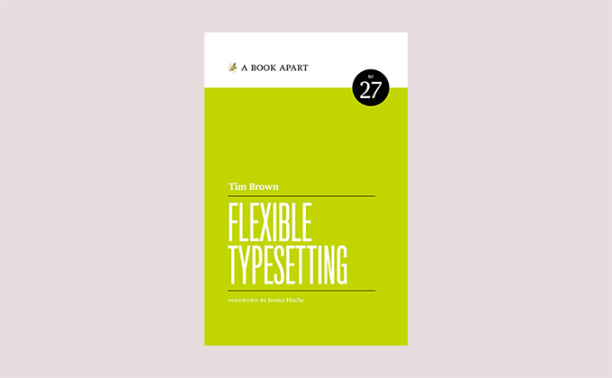
Flexible Typesetting
By Tim Brown · 220 Pages · 2018
Flexible Typesetting by Tim Brown isn’t a book about setting type the old fashioned way in static environments. It can best be summed up by this quote from the back cover that serves as its manifesto:
For the first time in hundreds of years, because of the web, the role of the typographer has changed. We no longer decide; we suggest. We no longer simply choose typefaces, font sizes, line spacing, and margins; we prepare and instruct text to make those choices for itself.Tim Brown, Flexible Typesetting
Although this is more of a technical book, some basics about typography are covered as well. Code snippets are included, as are links to live examples on CodePen. I wouldn’t recommend starting with this book if you are new to type, but if you are an experienced designer who sets type on screens, you will find this book invaluable.
View on A Book Apart →
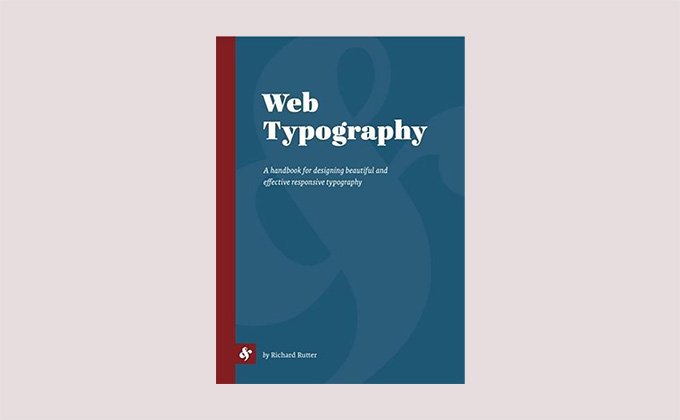
Web Typography
By Richard Rutter · 332 Pages · 2017
Richard Rutter’s Web Typography is a thick book that covers a lot of topics. It’s probably the most comprehensive of the books in this list as far as designing for the web. Responsive design is covered in detail, and it’s full of code snippets and brimming with visual examples. I haven’t seen this book mentioned in many other places around the web, but I think it deserves to be a classic. If you are a web designer who just wants to buy one in-depth book, get this one.
View on Richard Rutter’s site →
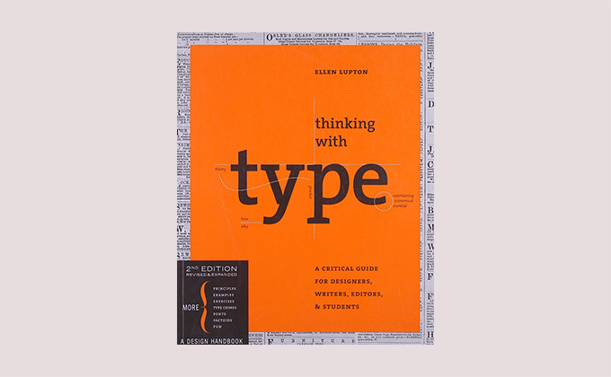
Thinking with Type
By Ellen Lupton · 256 Pages · 2004 (Revised in 2024)
For anyone who is a visual learner, I would recommend starting with this book rather than Bringhurst’s book mentioned above. The pages are filled with engaging, full-color examples, and it’s a quick, easy read. It’s written for more of a general audience that includes writers and editors, rather than just designers. The focus isn’t on the web as much; it’s just more of an all-around typography primer. I own the first edition (with the green cover) from 2004, but supposedly the second edition features more web-oriented content.
View on Amazon →
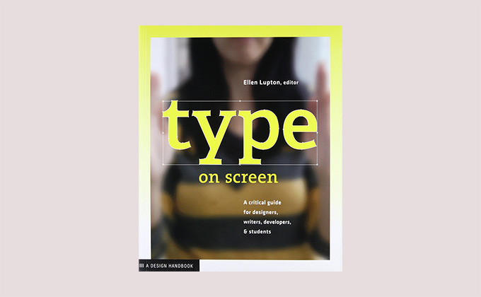
Type on Screen
By Ellen Lupton · 208 Pages · 2014
Type on Screen is marketed as a follow-up to Lupton’s previous book, Thinking with Type, but I much prefer the original. With this book, Lupton served as the editor, while it was researched and written by a team of students and faculty at Maryland Institute College of Art where Lupton teaches. I think this group approach to producing the book is what leads to its disjointed feel. It jumps from topic to topic without much cohesion.
The content does focus entirely on designing for screens, but the examples feel dated already. If you read it right when it was released in 2014, you probably would have found it much more pertinent than it feels in 2025. My recommendation would be to skip this one and stick with Thinking with Type, which feels much more like a classic that will hold up over time.
View on Amazon →
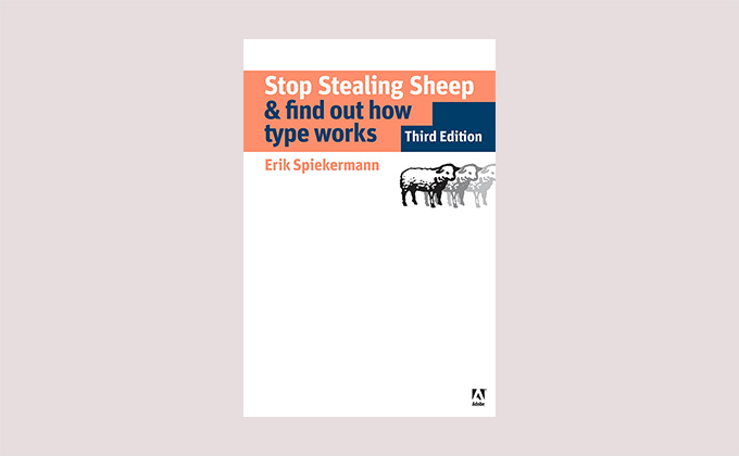
Stop Stealing Sheep & Find Out How Type Works
By Erik Spiekermann · 216 Pages · 1993 (Revised in 2013)
Named after Frederic Goudy’s famous quote about doing things to sheep (supposedly the original quote used a different verb than steal), Spiekermann’s classic book is a fun and quirky read. The writing style is unconventional, and Erik isn’t afraid to let his personality shine through using strange metaphors and examples.
Although it was revised in 2013, most of the content feels quite dated as it was originally published in 1993. It’s very much a product of its time (there is even a section on fax machines). That said, I still got a lot out of it and found it an enjoyable read.
View on Amazon →
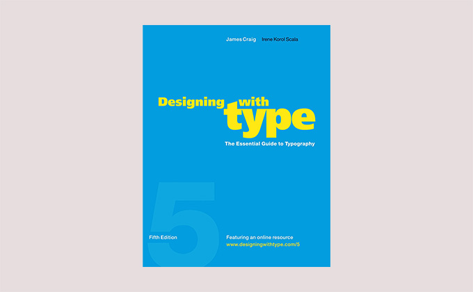
Designing with Type
By James Craig & Irene Korol Scala · 176 Pages · 1971 (Revised in 2006)
First published in 1971, Designing with Type is now in its fifth edition. Its longevity is a testament to its status as a classic. Commonly used in college curriculums on design, it feels more like a school workbook than a traditional book. It’s probably the most beginner-focused selection in this list, so if you are a complete newb when it comes to type, this is a great place to start.
View on Amazon →
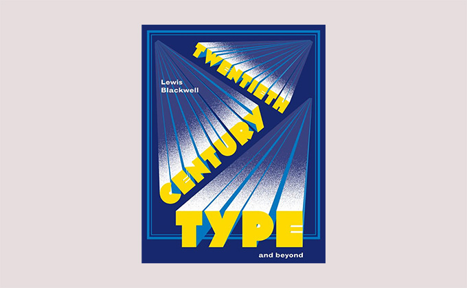
Twentieth-Century Type
By Lewis Blackwell · 216 Pages · 2004
I never finished reading this book because the type size was just too tiny. I don’t mind smallish type, but this is set in an incredibly tiny sans-serif (Helvetica, I think), which made the reading entirely unpleasurable. It was fun to flip through but felt too difficult to just sit down and read straight through. Which is a shame because I very much enjoyed the parts that I did read. The book is filled with illustrations though, so you can still get a lot out of it from just casually browsing through the pages.
View on Amazon →
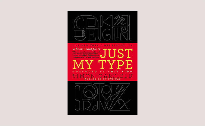
Just My Type
By Simon Garfield · 384 Pages · 2012
Just My Type is more of a casual beach read than a book you’ll want to keep handy in the design studio. It might not be educational in the sense it teaches you to use type more effectively, but it presents a nice historical overview of typography and how fonts fit into popular culture. I enjoyed it immensely and think anyone with an interest in graphic design should pick this one up.
View on Amazon →
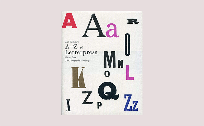
Alan Kitching’s A–Z of Letterpress
By Alan Kitching · 272 Pages · 2015
I wouldn’t recommend purchasing this unless you are a collector or a hardcore letterpress aficionado. It’s an incredibly gorgeous work that functions more as an art piece than a book. It would look beautiful on your coffee table, but I definitely wouldn’t recommend it for someone who wants to learn about typography.
View on Amazon →
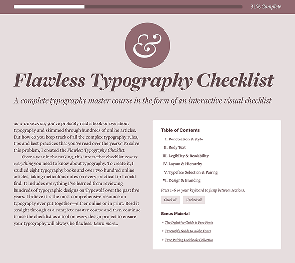
Don’t have time to read a stack of type books?
I’ve taken extensive notes from the books I’ve read in this collection and distilled everything I’ve learned into a single comprehensive resource. Learn more about the Flawless Typography Checklist.


