Ever wonder what fonts your favorite designers have been using lately?
I reached out to 41 of the most talented and influential designers in our industry and asked them to list their top 3 current favorite typefaces. I specifically asked for current favorites rather than all-time favorites—I thought that would make the results more interesting and would perhaps highlight some newer, less-established typefaces more so than timeless classics.
At the end of the post I compile all of the designer’s responses into a list of the top 11 most popular typefaces. What surprised me the most was the sheer diversity of the selections—88 different typefaces were mentioned altogether while only 19 of those were selected as a favorite by more than one designer.
The key takeaway—designers use a huge variety of different typefaces.
Jump straight to the top 11 most popular typefaces →
Aral Balkan · @aral

Aral BalkanAvenir Next is a flexible typeface by Frutiger and Kobayashi that has become my current workhorse. It is the main typeface for Indie Phone. I especially love the Ultra Light font.
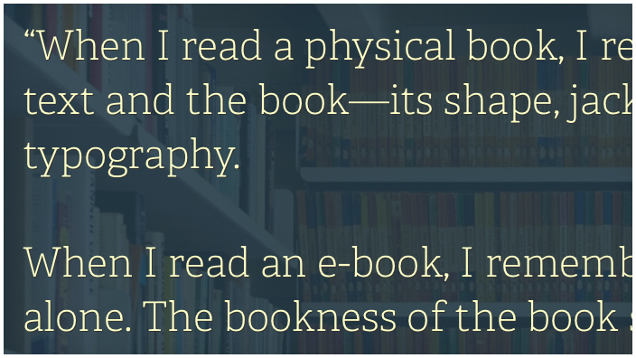
Sentinel is a beautiful slab serif that is versatile enough for both display and text. I use it exclusively on my personal site. It has a gorgeous italic that is perfect for setting summary paragraphs and contrasts beautifully with one of the heavier fonts (e.g., see the figure captions on the site). The ScreenSmart fonts in general are lovely to read on a variety of devices and resolutions.
OpenDyslexic is a good reminder that typography is not just about the aesthetics of text but about the function of reading and comprehension. Accessibility is a core element of design, not an afterthought, we should all be thinking of supporting typefaces that aid people with various challenges.
Jesse Bennett-Chamberlain · @jessebc

Kai Brach · @kaibrach

Daniel Burka · @dburka

Adelle Charles · @adellecharles

Adelle CharlesAdelle—beautiful for print and large headings on the web.
Proxima Nova—plenty of weights available and is great for websites.
FF Tisa Web Pro—great for long form reading and small paragraphs.
Frank Chimero · @fchimero

Ben Cline · @yocline

Jon Contino · @joncontino

Chris Coyier · @chriscoyier

Chris CoyierVerlag—sturdy, classy, yet slightly relaxed.
Lucida Grande—you can make a font-family stack with it that works pretty well cross browser and feels more chill than the rest of the typical web safe font stacks.
Gotham Rounded—the CSS-Tricks logo and header font. So soft.
Mike Davidson · @mikeindustries

Jared Erondu · @erondu

Nicholas Felton · @feltron

Dave Gamache · @dhg

Sacha Greif · @SachaGreif

Sacha GreifProxima Nova Soft—Proxima Nova may be overused, but its rounded cousin is just as beautiful, and is still somewhat of a hidden gem.
Avenir Next—the hip alternative to Proxima Nova and Helvetica, Avenir is elegant yet full of personality.
Source Sans Pro—if you want an awesome sans but can’t afford pricey typefaces, Source Sans Pro is not only completely free but also beautifully designed. I’m using it on Discover Meteor.
Janna Hagan · @_jannalynn

Jonnie Hallman · @destroytoday

Jessica Hische · @jessicahische

Jessica HischeI only use typefaces occasionally—most of my work is lettering. If I had to name the typefaces that I use the most right now, they’d be:
Sweet Sans (which I sometimes integrate into my work as a small sans-serif).
The Harriet Series (which I use as the text in my talks).
These are kind of my primary typefaces at the moment, and if I had to toss one more on there just because I like it, I think it would be Maiola. I really love sharp calligraphic serif typefaces like Maiola.
Nick Jones · @narrowd
Laura Kalbag · @laurakalbag

Laura KalbagMy current favourite typefaces are HVD’s Brandon Text and Supria Sans. I could probably survive for a long time using nothing but HVD Fonts. Both Brandon Text and Supria Sans are very easy-reading with their generous x-heights and friendly shapes. With the geometric shapes combined with long-ish ascenders and descenders, Brandon Text reminds me of art deco design. Supria Sans has one of the most fun italics which has loads of character and quirkiness whilst staying legible.
Linotype’s Trade Gothic is my go-to for a more utilitarian feel (I still like some personality with my utility!) The upright letterforms make for compact and tidy paragraphs.
Ben Kiel · @hithro · @typefounding

Ben KielYorklyn Stencil—Ken Barber’s take on the Le Corbusier stencil genre, but filtered through Ken’s unique sensibility and talent for combining the best of both lettering and typeface design. It is currently unreleased, but can be seen used all over the House Industries Heath Clocks. A birdie tells me that it will be released soon.
Neutral—Kai Bernau’s search for a Platonic idea of a typeface devoid of stylistic reference—which becomes its own stylistic reference. I really love the process and the end result behind this work and then re-release of the design.
Balto—Tal Leming’s take on the American Gothic. I don’t do much graphic design work these days, but this face was a complete joy to use in a recent architectural book design. Don’t miss Tal’s thoughtful reflection on making the typeface family. His evidenced level of thought and care comes through as a user of the family, everything you would need (weight range, glyph coverage) is there. Web geeks, peek at how Tal is using SVG in his site’s specimens...
Nishant Kothary · @rainypixels

Nishant KotharyAvenir—I’m doing only iPhone development right now, and it’s a solid, safe choice with really good delicate weights for retina displays.
Minion Pro—it’s my current favorite for Web applications that are text/reading heavy. I use it on my personal site.
Sentinel—this falls in the all-time favorites category which is a superset of my current favorites category, and thus earns one of the three spots.
Dan Mall · @danielmall

Sean McCabe · @seanwes

Kyle Meyer · @kylemeyer

Shane Mielke · @shanemielke

Debbie Millman · @debbiemillman

Christoph Niemann · @abstractsunday

Richard Perez · @skinnyships

Veerle Pieters · @vpieters

Brandon Rike · @brandonrike

Brandon RikeGotham is popular for a reason. Its ability to be the most neutral typeface in my arsenal keeps me coming back to it time and time again. It’s able to get a message across without saying anything other providing a bit of sturdy simplicity. I truly believe that Gotham has managed to be more neutral and pedestrian than Helvetica, which, in the type world, is a truly remarkable feat.
DIN-Medium has just enough modern angles to keep it clean and current, but can also work as a very vintage, standard typeface. I can use it for clean collateral, but also arched over top of a vintage stamp style piece. Like Gotham, it gets out of the way, doesn’t say too much, and does its job.
About 2 years ago, I started injecting Stratum2 into some of my own personal branding. There’s a tension with Stratum2 of being too “techy”, as it can work very well with a high-tech aesthetic. But I enjoy using Stratum2 in more vintage settings, which continues to surprise me. Somehow it works in a variety of applications that wouldn’t be immediately assumed.
Tobias van Schneider · @schneidertobias

Tobias van SchneiderMaison Neue is a monoline grotesque typeface. One of my favorites and also since it came out in 2010 designed by Berlin-Zurich-based Timo Gaessner. I use it only as my “House of van Schneider” corporate/house typeface. It’s just a perfect fit since Maison is French and means “house.”
Euclid Flex is another beautiful sans-serif designed by one of my favorite type foundries. It’s not that special anymore since it’s been used by a lot of people already (I like when they’re more unknown). I was in love with it for a while, used it in a lot of branding work and still go back to it quite a lot.
Akzidenz Grotesk is a grotesque (early sans-serif) typeface originally released by the Berthold Type Foundry in 1896. It’s a classic and pretty much one of my all time favorites. I would always prefer it over Helvetica (which was actually inspired by Akzidenz Grotesk)—it’s timeless, bold and minimalistic but still has this unmistakable charm and character to it.
The Corporate ASE typeface trilogy was designed by Prof. Kurt Weidemann, a well-known German designer and typographer, from 1985 until 1990. This superb trilogy consisting of the Corporate A (antiqua), Corporate S (sans-serif), and Corporate E (Egyptian) is a design program of classical quality, perfectly in tune with each other. It was originally designed for Mercedes-Benz.
Kris Sowersby · @klimtypefoundry

Kyle Steed · @kylesteed

Kyle SteedFutura Bold—does it really get any better?
Frontage—similar to Futura, but with a little extra flair.
Funktion—okay, I’m a little biased.
Elliot Jay Stocks · @elliotjaystocks

Kerem Suer · @kerem

Kerem SuerAnd one bonus, that is not available for us to use I believe, Swiss Air’s custom font CH Sans designed by Freda Sack. It can be seen all over the place on Swiss.com.
Collis Ta’eed · @collis

Collis Ta’eedAvenir—in all its forms, we use the Rounded for Envato and I’ve fallen in love with the typeface.
Open Sans—not so much for its beauty as a typeface, but for what it represents about open source typography.
Veneer—this is mostly just a fun typeface that I’ve been playing with recently.
Haraldur Thorleifsson · @hthorleifsson

Edwin Tofslie · @tofslie

Khoi Vinh · @khoi

Rob Weychert · @robweychert

Jeffrey Zeldman · @zeldman

Jeffrey ZeldmanI’m a die-hard Franklin fan, particularly for Franklin Gothic Condensed Bold. The best cut of this for the web is by Font Bureau’s Webtype.
For readability, I’m loving Adelle Sans (Thin, Light, and Regular, depending on size and use). I bought the print family from FontShop and use Typekit for the web... although nowadays, you’d just use Typekit for everything.
For titles, I’m also a huge fan of Abril Titling Condensed, from the same sources as Adelle Sans.
The Top 11 Most Popular Typefaces
The following list is highly-unscientific. After totaling the responses from the 41 designers, Avenir received 6 votes, Brandon Grotesque received 5 votes and the rest on this list received just 3 votes each. So the only reason that Trade Gothic is #11 and Adelle is #3 is because I ordered the fonts with 3 votes alphabetically. So take this list with a huge grain of salt…
11) Trade Gothic
10) Sentinel
9) Proxima Nova
8) Open Sans
7) Minion
6) Gotham
5) DIN
4) Akzidenz Grotesk
3) Adelle
2) Brandon Grotesque
1) Avenir
So there you have it. Avenir was the most mentioned typeface out of responses from 41 designers. The top 11 list actually isn’t that different from the list of the 15 most popular fonts on Typewolf (scroll down to the footer). But that shouldn’t be surprising as Typewolf is a curated site influenced by my own personal preferences about design, which I’m sure influenced which designers I chose to reach out to in the first place.
Finally, I wanted to thank all of the awesome designers who took time out of their busy schedules to participate. Without them this post wouldn’t have happened—so a big thanks to all the designers involved!


