This is the 27th installment of my monthly feature on Typewolf where I share my favorite type-driven websites from the previous month and then write a little about the typographic details behind the designs. You can check out last month’s post for March here.
Nurture Digital
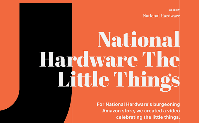
Abril Fatface, the high-contrast serif seen in this screenshot, is actually a free font available on Google Fonts. It’s part of a larger type family created by TypeTogether but only the fatface cut is available on Google Fonts. The contrast is so high that it only works at large sizes so it’s paired here with another member of the Abril family that works better at smaller sizes. Dalton Maag’s “Helvetica killer”, Aktiv Grotesk, rounds out the design.
Wrong Wrong
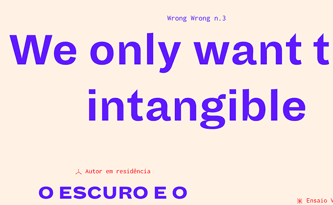
The type on the Wrong Wrong homepage feels a bit chaotic, with article headlines switching between a sans-serif and serif seemingly at random, in both uppercase and lowercase. The chaos is balanced by the article pages, which take on a more traditional typographic layout, with type set entirely in Tramuntana, a classy Renaissance inspired face. The sans-serif seen in the screenshot above is Dia, an odd grotesque from Schick Toikka that gets wider as the weights get heavier.
Techies
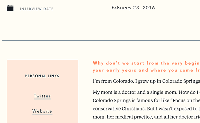
Futura is the most popular font on Typewolf, so I’m happy to point out this isn’t Futura used on the Techies site—it’s actually FF Super Grotesk, known as the “East German Futura.” It’s actually quite different from Futura when you look closely, with a much smaller x-height and slightly less geometric letterforms. Usually, it’s a typographic faux pas to letterspace lowercase type, but the spaced FF Super Grotesk in the titles helps give off a more dramatic appearance. The site only loads a single font file from the Tiempos Text family for the body text which is great for performance but inevitably leads to faux italics which you can spot throughout the articles.
Brand Nieuwe Conference
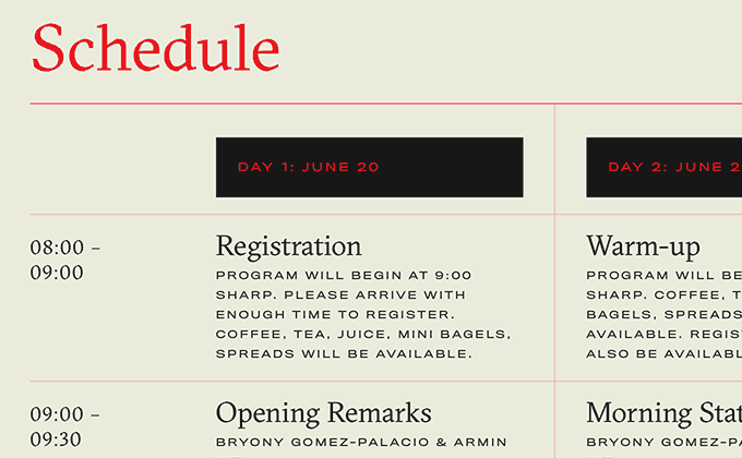
GT Sectra was chosen for this year’s Amsterdam BNConf identity because of the letterform’s resemblance to the sharp turns of Amsterdam’s historic canals as seen on a map. It’s a pretty clever concept and it’s always nice to hear the reasons behind typeface selection. Font Bureau’s Titling Gothic was chosen to pair with it because “it’s not a geometric sans”, which is most likely a stab at how ridiculously popular geometric sans-serifs are becoming. The navigation and footer text set on top of the background art is pretty unreadable in places but luckily the solid color hover effect solves the problem, although on touch devices, relying on a hover effect might not always be a good idea.
Préface
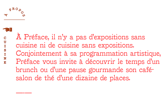
Drury Lane is a quirky typeface that the designer describes as “slightly clumsy yet eager to please.” The capital letters feel a tad heavier than the lowercase which gives it a wobbly feel. But it makes for a great branding face due to its uniqueness and feels like a great typeface choice for this French café.
City Observatory
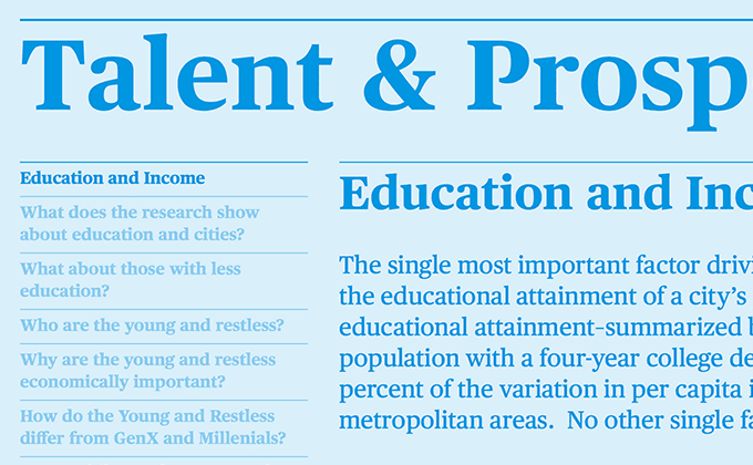
I tend to have a preference for sites that make good use of color rather than sites that just stick with black text on a white background. I think color really makes type come alive and text can still be plenty legible even if it isn’t set on a pure white background. The City Observatory site is a great example of mixing type with color—I love the treatment of colored type set on a lightened color background. Commercial Type’s Publico is used as the sole typeface throughout the design but unfortunately, this is another site this month that doesn’t load any italic styles, so there are a few places where faux italics are popping up.


