This is the 54th installment of my monthly feature on Typewolf where I share my favorite type-driven websites from the previous month and then write a little about the typographic details behind the designs. You can check out last month’s post for June here.
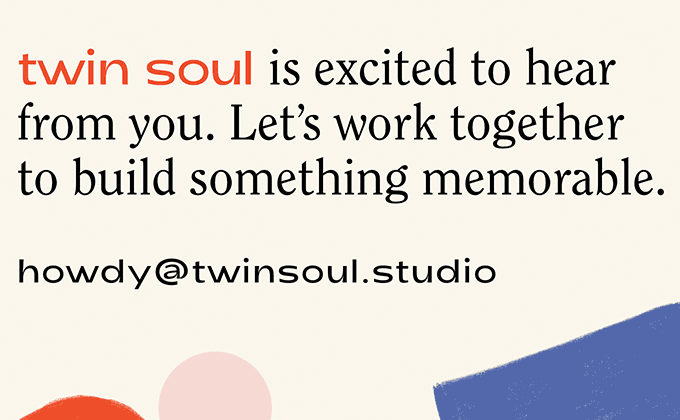
Twin Soul
The Twin Soul site combines two fashionable, contemporary sans-serifs—Adieu, a wide-bodied sans with high contrast, and Sneak, a quirky grotesque with an s that looks like it is flipped upside down. The addition of the serif ITC Clearface adds a warm, retro touch to the design which harmonizes nicely with the colorful geometric shapes. My only critique is that the type sizes continuously scale up based on screen size, so on a large monitor like mine the headlines end up with gigantic text that fits only one or two words per line when the browser window is at full width. Update: this minor issue has since been fixed.
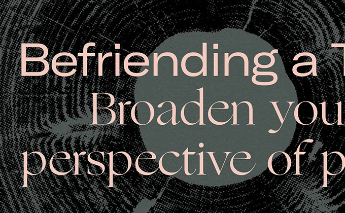
Emergence Magazine
Windsor, together with ITC Clearface mentioned above, are two of the more popular typefaces leading the resurgence of 1970s-evoking serifs. I think they add a welcoming feeling of warmth to the design landscape, amidst the cold sterility of neo-grotesques and geometric sans-serifs. The serif Ogg, used for headlines here, has fairly wide proportions, so it was a clever idea to pair it with the extended cut of GT America. When stacked on top of each other, they feel balanced and even.
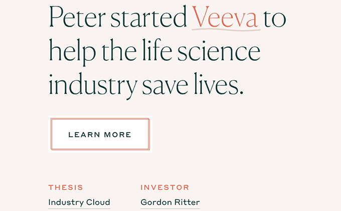
Emergence
Emergence (completely unrelated to Emergence Magazine featured above) is a venture capital firm with a brand that comes across as stylish and classy in contrast to the techie look that is stereotypical of VC companies. The illustrations help with this as does the type. Canela feels chic and elegant, while Styrene adds a more modern touch. Neither Styrene nor Canela are ideal for body copy (although a text version of Canela was actually just released by Commercial Type last month), so the ever-popular neo-grotesque/gothic hybrid GT America is added into the mix to set the body text.
MIT
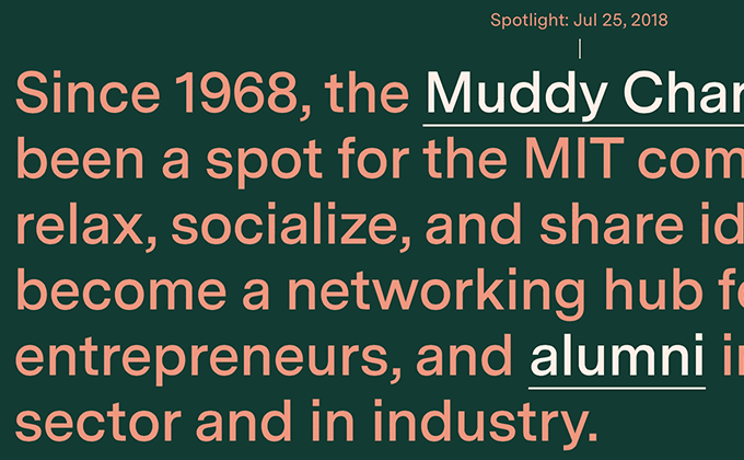
The MIT redesign was lead by the talented folks at Upstatement, who are one of my favorite design agencies at the moment. It seems like I end up featuring almost all of their projects on Typewolf (they also did the Emergence site above). The entire site is set in Luzi Type’s Messina Sans, with typographic contrast coming from different sizes and weights rather than different type families.
The Spotlight section on the homepage features colorful text that switches to a different color theme every day. Some people really despise this kind of type treatment, as evidenced by the “this must have been designed by the same color-blind folks that did Dropbox” comment I saw on Designer News. But that seems to be a common complaint of a certain subset of people whenever a site strays too far from default black text on a white background. I personally love the look and think it adds personality to brands which is sorely lacking on the web these days.


