This is the 38th installment of my monthly feature on Typewolf where I share my favorite type-driven websites from the previous month and then write a little about the typographic details behind the designs. You can check out last month’s post for February here.
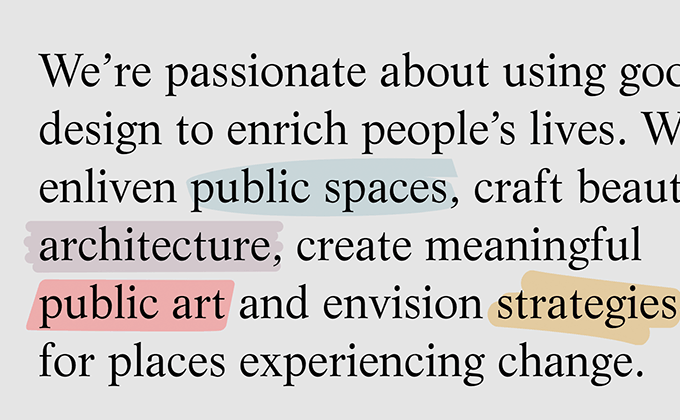
Dallas Pierce Quintero
Times New Roman has been experiencing a bit of a renaissance on the web —it went from being a boring, default choice to a fashionable typeface over the span of just a few years. Life, the typeface used here, shares a very similar aesthetic with Times but differs in a few small details—notice the ball terminal on the ear of the g and a more calligraphic r. I love when designs appear to be going after a trendy look but differ in the subtle details. Recta, the sans-serif used here, fits that definition as well. It feels like a contemporary neo-grotesque/geometric sans but actually has a lot more history to it as it came out in 1958, right after Helvetica.
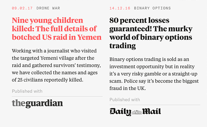
The Bureau of Investigative Journalism
This site is probably on the upper limit of what’s acceptable as far as using too many fonts—I count ten individual font files being downloaded—but the type is gorgeous. The lack of banner ads really gives the type room to breath, compared to most news sites. Tiempos, a Times-inspired contemporary serif from Klim Type Foundry, is used in both the text and display versions. Bebas Neue, the condensed sans used in the headlines, is a free font but one that you really don’t see used as much as it’s not on Google Fonts. Grilli Type’s GT America makes an appearance as well, adding to the font count. But despite the number of fonts used, the design still manages to feel cohesive.
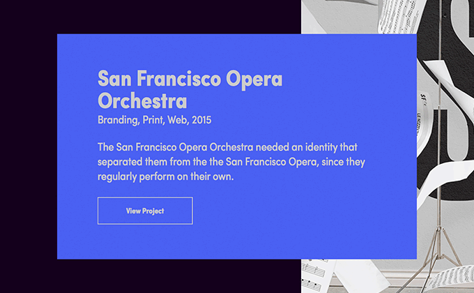
For Good Measure
Sofia is a Futura-esque geometric sans available on Typekit that is starting to feel a bit overused. However, the condensed styles are used here which immediately makes the design feel fresh. Going with a less commonly used width or weight is a good trick to make your typography feel a little more distinctive.
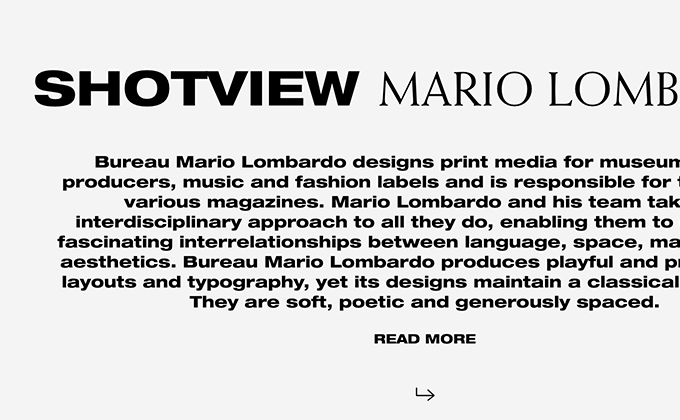
Shotview
Helvetica Neue is a huge family available in a wide range of widths and weights, however, we almost always just see the standard styles used on the web, as that is what is commonly available as a default system font. The extended cut is used here—it’s not the most readable font but the text on the site is pretty minimal. The serif Weiss is paired with it, set entirely in uppercase. Weiss is unique in that it features a top heavy s that almost feels like it is upside down.
Offscreen
When I first saw the recently redesigned Offscreen, I felt a little disappointed in the type choice. Going with a single typeface—and a neo-grotesque at that—felt a little bland. However, the design has since really grown on me. Acumin has a simple, plain elegance to it and the more I look at it, the more I notice little peculiarities that make it differ from typical neo-grotesques such as the stroke on the J that terminates vertically rather than horizontally. Apparently, the typeface worked really well for the constraints of printing in a compact magazine format as well.
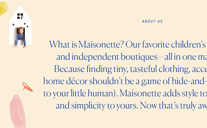
Maisonette
In the almost four years of running Typewolf, I don’t think I have ever seen a new typeface blow up as quickly as Canela has. Since its release in 2016, it’s been featured ten times on Typewolf (and I have received many, many other site submissions using it). It’s a beautiful typeface that fits somewhere between a serif and a sans-serif design. It really seems to have struck a chord with designers at the moment. As Canela was created as a display face, Plantin is paired with it here for body text. The addition of GT Walsheim adds a playful touch which keeps the design from looking too serious, which feels appropriate for a children’s brand.


