This is the 33rd installment of my monthly feature on Typewolf where I share my favorite type-driven websites from the previous month and then write a little about the typographic details behind the designs. You can check out last month’s post for September here.
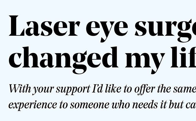
The Vision Mission
Noe Display has been popular as of late but this is the first time I’ve seen the beautiful italic cut used. The sharp, triangular serifs are still present in the italic but are slightly toned down to give the letters more of a flowing, cursive look. The body text is set in Colophon’s open-source Space Mono. Normally, monospaced fonts don’t read well for body copy, however, the narrow line length here keeps things easily readable.
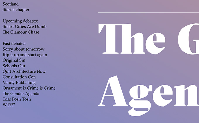
Turncoats
Grilli Type’s calligraphic serif GT Sectra is the sole type family used on the Turncoats site, with the heavy, super weight used for the large headers. The paragraphs have an ideal line height, however, the line height in the headers looks to be a little too much, with some pretty big gaps between the lines. Large headers usually need much tighter line spacing and can sometimes even need to be set with negative leading. A gradient background that reads well with both white text and black text set on top is always a challenge to design, but when successful like this, creates a dramatic composition.
Klépierre
The headlines on this site are actually set with negative leading, meaning the line height is less than 1.0. This keeps the space between lines nice and tight, but can lead to ascenders and descenders colliding (which unfortunately occurs in the main headline at the top of the page). Sometimes playing with the line wraps can help avoid the collisions, but other times it’s unavoidable when the line height is this tight. Lyon Display is used throughout, including the small amounts of paragraph text. For a display face, it still reads pretty well at smaller sizes.
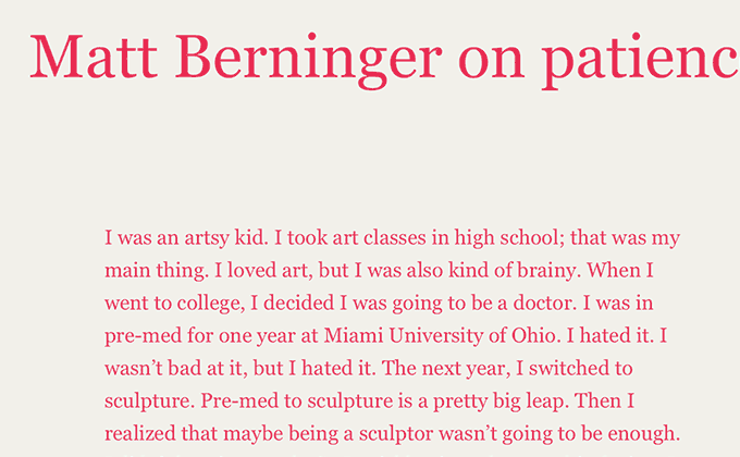
The Creative Independent
The Creative Independent is one of the few sites I’ve featured on Typewolf that relies entirely on system fonts, using only Georgia and Courier. It’s still common to see sites use Georgia for body text, but here Georgia is used as a display face as well. Using standard fonts like these typically leads to a bland, generic design, however, the dramatic use of color gives the type new life. Text doesn’t need to be set in black on a white background to be readable, which this site perfectly demonstrates.
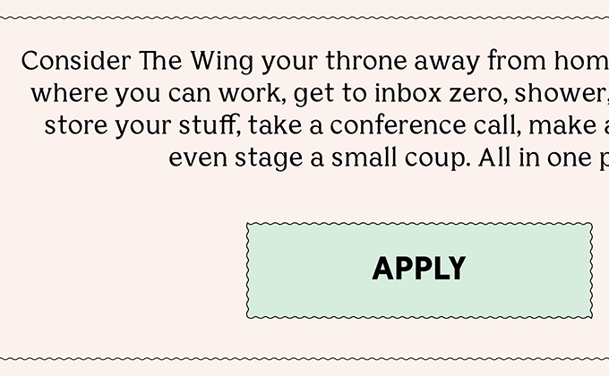
The Wing
The easiest way to ensure harmony between typefaces is to go with a superfamily. Bianco Serif shares a similar skeleton with Bianco Sans, but with added wedge serifs. The letterforms are different enough to contrast with one another, but the basic shapes still harmonize. The compressed cut of Bureau Grot is used sparingly for the headers and differs enough from the other two typefaces to add even further typographic contrast.
Anyways
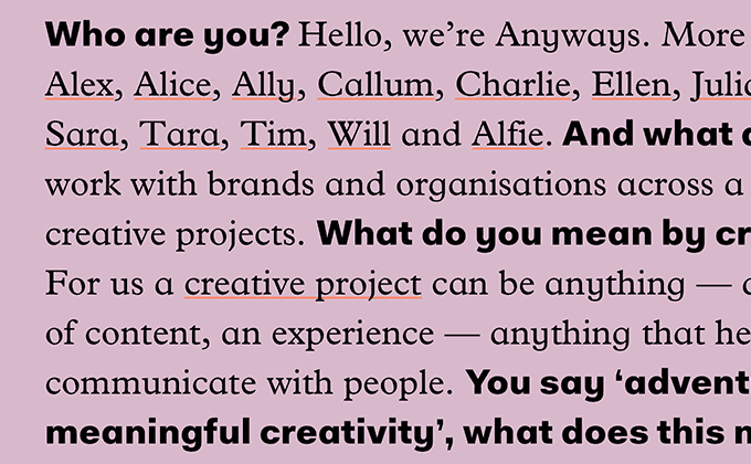
I’m really impressed by the clever type pairing on the Anyways site. Fakt is a grotesque that includes a geometric-style single-story a as a stylistic alternate, which is enabled here. It’s combined with the seldom used Infant version of Plantin, which includes a single-story a as well. The two single-story a’s create an immediate harmony between the two typefaces. A geometric sans with a single-story a, such as Futura, wouldn’t have paired as well with Plantin, so using a grotesque with a stylistic alternate was a pretty clever solution.


