This is the 56th installment of my monthly feature on Typewolf where I share my favorite type-driven websites from the previous month and then write a little about the typographic details behind the designs. You can check out last month’s post for August here.
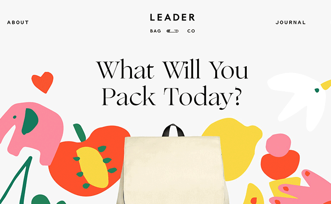
Leader Bag Co
Ogg is a beautiful serif that is full of character and personality. It has some unusual features, such as the lower stroke on the e that tends to stick out into the letter that follows it, but that is what makes it so unique and memorable. It’s combined here with Freight Text for body copy and Pitch Sans for navigation and captions. I love the colorful, childlike illustrations, but they feel a little out of place next to the products being sold which come across as more chic and fashionable than fun and quirky.
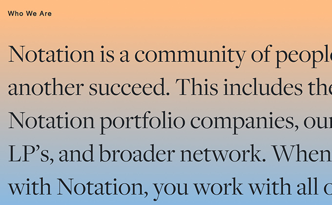
Notation
This is the first use of Halyard I’ve featured on Typewolf which is a little surprising as the entire family is readily available on Adobe Fonts (Typekit), and Joshua Darden’s other superfamily, Freight, has been massively popular for quite a long time. The design of Halyard was influenced by the classic grotesques of the nineteenth and early twentieth centuries, but it feels a little more even and regular compared to the grotesques of that era which often feel a little off-kilter and wonky. It’s paired here with Freight Display which is used at large sizes for headlines (as intended), while Freight Text is used for body copy. The Freight and Halyard families pair together nicely, as is oftentimes the case with typefaces from the same designer.
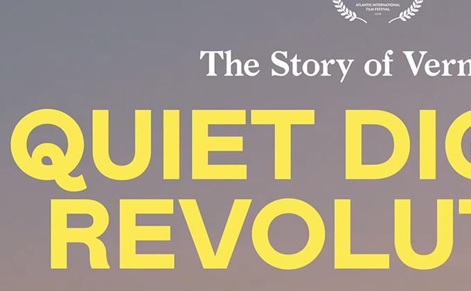
The Story of Vermont’s Quiet Digital Revolution
I love the Q on Colophon’s Mabry typeface—it was the perfect choice for setting the title here as it immediately stands out and gives a distinctive look to the branding. It contrasts nicely with the serif Larish Neue, set directly above it. The body text, set in Graphik, has a readable, narrow width, and the pullquotes breaking out from the grid make the page feel more dynamic. The wide-bodied Adieu is used for bylines and labels, and a fourth sans-serif, Helvetica, is used sporadically as well but probably isn’t really needed since there are already three other sans-serifs being used.
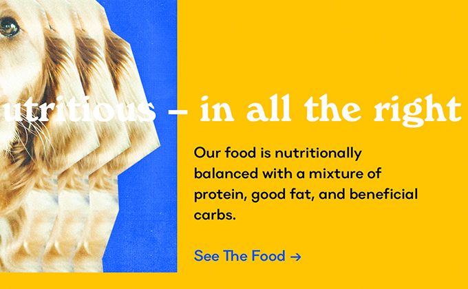
Porter & Pals
When I first saw this site, I had no idea it was for a dog food company as the branding is completely bizarre. But I think it is brilliant. As a dog owner myself, I know that the market for specialty dog food is completely saturated—and every brand kind of looks the same. Porter & Pals are probably aware of this and wanted to do something to quickly distinguish themselves from their sea of competitors. And I think they have succeeded here. Their brand feels crazy and exciting and different from anything else out there.
The type plays a huge role in this. The sans-serif Danzza is a geometric/grotesque hybrid that feels genuinely happy—the oversized tail on the g makes it look like it is smiling at you. Windsor has a retro charm that exudes warmth. And Suisse Int’l Mono has a techie feel that matches the aesthetic of the colorful gradients. The type choices, combined with the imagery and colors, come together to create one of the most memorable brands I’ve seen.


