This is the 39th installment of my monthly feature on Typewolf where I share my favorite type-driven websites from the previous month and then write a little about the typographic details behind the designs. You can check out last month’s post for March here.
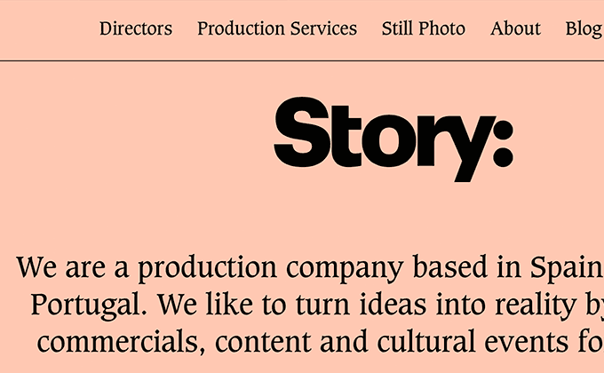
Story
Caxton is one of those typefaces that I like to describe as evil—something about its heavy, concave serifs makes it feel rather forbidding. It’s balanced here by the warm colors which make the design feel a bit more open and inviting. The headers using Graphik are set tightly with negative letterspacing, a treatment that tends to give neo-grotesques more of a retro-1970s feel.
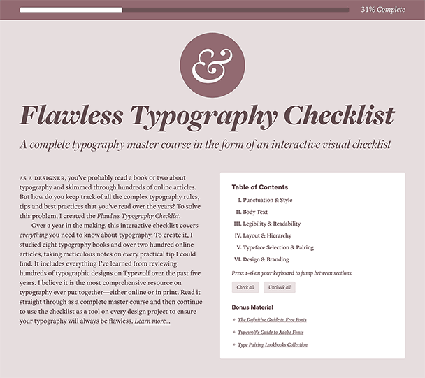
Increment
Increment is a new publication from Stripe with gorgeous illustrations and beautifully-set typography. The headlines are set in Px Grotesk, a unique neo-grotesque that features abrupt, right angles. The body text, using Tiempos Text, is set with obvious attention to detail—proper dashes, apostrophes and quotation marks are used and they even implement hanging quotes on the blockquotes on this page.
Santa Fe Institute
I think high-contrast, calligraphic sans-serifs like Chap are going to be the next big trend in type. They seem to be gaining in popularity and this style of typeface feels so much fresher than the quotidian neo-grotesques that dominate design at the moment. I love the type on this site but I’m not too sure about the pairing of Chap with DIN. Sometimes pairing two sans-serifs together can work, however, in this case, the aesthetic of the two typefaces doesn’t really match. DIN tends to feel modern and techy, while Chap has more of an organic, human feel. Chap actually reads pretty well as a text face, so perhaps they could have gotten away with using a single typeface family throughout rather than introducing a second sans-serif.
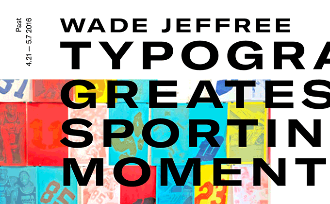
XXXI
The XXXI site uses a single type family and an innovative technique where different fonts are loaded depending on the screen width. The expanded width of GT America is loaded on desktops, but on smaller screen sizes, the compressed width is loaded. This technique makes more efficient use of the screen real estate available on different device sizes. In the future, this technique will be accomplished using variable fonts, but for now this is a pretty cool solution and hopefully a preview of what we’ll see more of in the coming years.
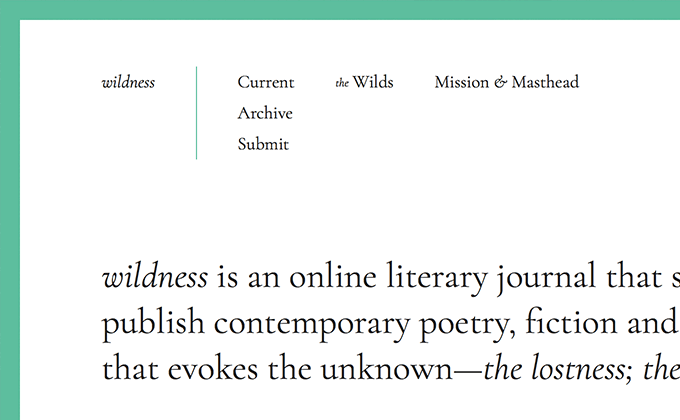
wildness
Cormorant is a newish family on Google Fonts, so it hasn’t really spread across the web too much. It was designed as a display face and is described as having “scandalously small counters.” This makes it a poor choice for body copy as small counters tend to fill in at text sizes. However, the Cormorant family is available in several variations and the version used here, Cormorant Garamond, was designed with slightly larger counters and is thus more suitable as a text face. The body text here actually reads pretty well. The line height is set with generous spacing which feels appropriate for a literary journal, as open spacing slows down reading and gives type more of a poetic feel.


