This is the 36th installment of my monthly feature on Typewolf where I share my favorite type-driven websites from the previous month and then write a little about the typographic details behind the designs. You can check out last month’s post for December here.
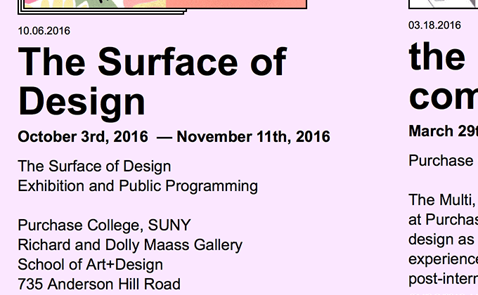
Purchase College Graphic Design BFA Program
Some people will probably find it ironic that the site for a graphic design BFA program uses lowly Arial as its sole typeface. I’m not sure if they are purposefully using it in an ironic manner or if they just wanted a fast loading site without having to deal with web fonts, but the type choice actually feels pretty fresh. Arial seems to be used way less often than Helvetica these days, so it comes across as much more distinctive, especially at display sizes. The terminals in Arial are angled rather than straight like in Helvetica, so it recalls older grotesques like Akzidenz Grotesk and Monotype Grotesque more so than neo-grotesques.
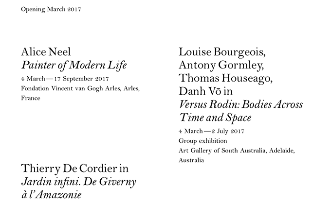
Xavier Hufkens
This is another site this month that uses a single typeface throughout the entire design. Bell is a Transitional serif from the eighteenth century that features a beautiful italic which you can see used for the artwork titles in the headlines. The numbers in Bell are rather ornate and are set at three-quarters of the cap height, which makes them almost feel like small caps. There is no bold weight used on this site which shows it’s possible to get sufficient contrast using only roman and italic.
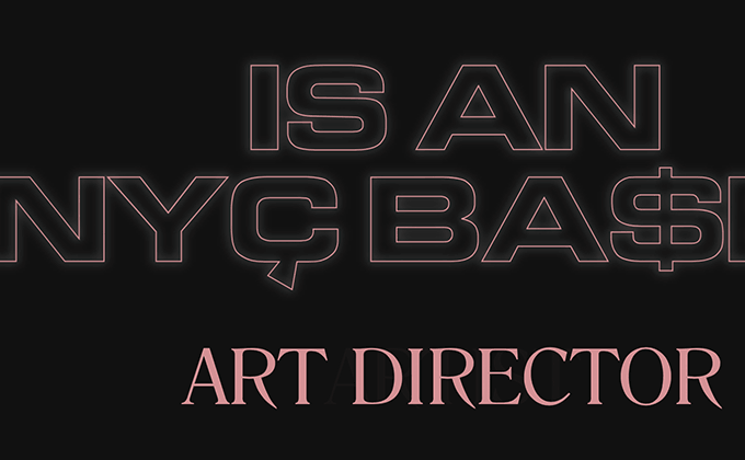
Matthew Boblet
The flashing and flickering type on Matthew Boblet’s site isn’t meant to be read as much as it’s meant to make a purely visceral impression. The logo is set with Wilhelm Klingspor Gotisch, an elaborate blackletter face, which combined with Romana, feels especially evil. An outlined cut of Eurostile is set with a soft glow, which adds in a dark, sci-fi sort of vibe. The design feels more like an art installation than a website and perfectly demonstrates the emotional impact that typography can create.
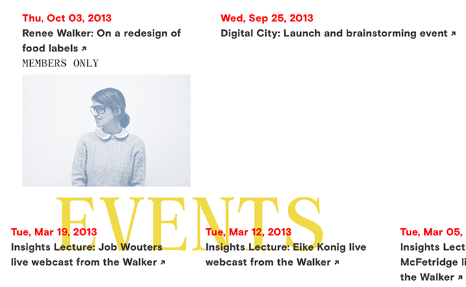
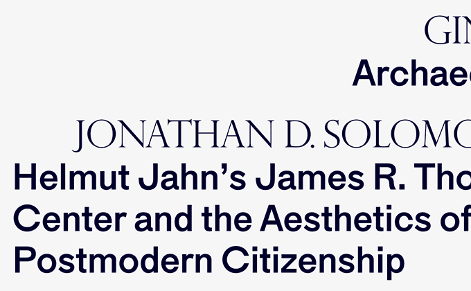
The Design Office
The Design Office site feels like it is stepping outside of current trends and doing its own thing. The grid is unusual, with none of the elements feeling confined to neat columns. The page titles are set in a fixed position in the center of the layout with the other text floating on top. The type choices are pretty unique as well, using two of the less-trendy fonts from the Colophon catalog—the serif Archive and sans-serif Basis Grotesque.
The Avery Review
As much as I love this site, I have to say that the typography is more creative and engaging than it is functional. The article pages are set with a line length that expands with the browser window, creating paragraphs that are too wide to read comfortably and the first-line paragraph indents are so unusually large that they become distracting. Maria isn’t ideal as a text face as it doesn’t contain italics and the author bios are set entirely in uppercase Perpetua Titling, which becomes difficult to read for anything that spans more than one line. That being said, I still really dig the general aesthetic and think the designers did a great job of creating something unique and memorable.
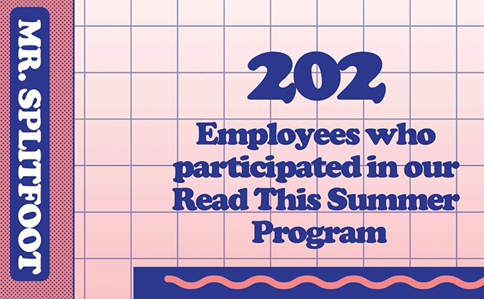
MailChimp 2016 Annual Report
MailChimp went with a fun, 80s-inspired theme for their 2016 annual report and I think their type choices perfectly complement this look. Cooper Black is the quintessential retro font that brings to mind the late 1970s and early 1980s and Grilli Type’s GT Walsheim pairs surprisingly well with it. The oversized dots on GT Walsheim’s i’s play off the bubbly, rounded shapes of Cooper Black, while the curvy tails on GT Walsheim’s lowercase g and y always make me think of smiley faces, which further adds to the playfulness of this design.


