This is the 18th installment of my monthly feature on Typewolf where I share my favorite type-driven websites from the previous month and then write a little about the typographic details behind the designs. You can check out last month’s post for June here.
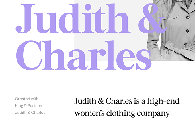
Margaux Le Pierrès
Burgess is a serif typeface from Colophon Foundry that is based loosely off Times New Roman so it has a comforting sense of familiarity to it. Founders Grotesk from Klim Type Foundry is used for auxiliary text and makes a nice combo with Burgess as grotesques usually pair well with Transitional faces. I think the type treatment with the text partially over the photo is a nice touch that makes the design feel a little less rigid.
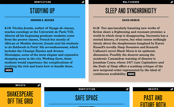
Public Books
Monotype Grotesque is an early grotesque that is full of irregularities and inconsistencies between its various weights and widths. I think it helps add a bit of vintage character to the Public Books design. The text on the interior pages, set in Plantin, uses indents to mark paragraphs rather than line breaks, making it feel more like a book than a typical website. Adrian Frutiger’s monospaced OCR B, a typeface rarely used on the web, is used for labels.
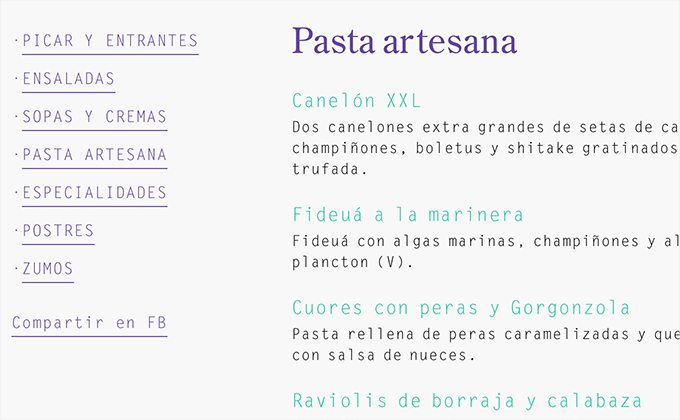
Baobab
This site is an excellent example of designers translating a print identity to the web and keeping the type consistent. Although the website tends to feel almost a little over reliant on the monospaced Letter Gothic—it might have been nice to see Century Old Style or the chunky 1970s-evoking serif, ITC Grouch, used more to make the design feel a bit less monotonous.
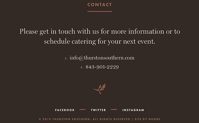
Thurston Southern
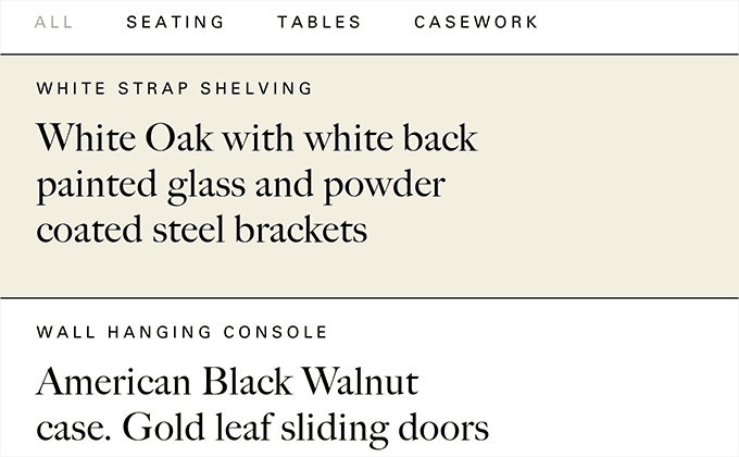
Miller is a serif typeface designed by Matthew Carter, the same designer of the ubiquitous Georgia. Both designs were heavily influenced by Scotch Romans so they share some similarities, however, the display version of Miller used here has much higher contrast so there is no mistaking it for Georgia. Usually using a display face to set body text is a bad idea but the type here is minimal and set at a large size so legibility isn’t an issue. Scotch Romans fall into the Modern category of serifs with their vertical stress and high contrast, so they tend to pair well with geometric sans-serifs like Futura which is used as the secondary typeface set entirely in uppercase with slight letterspacing
The Nation
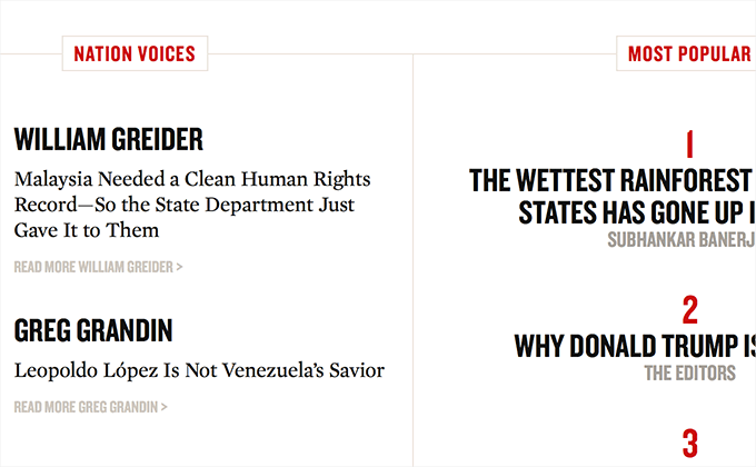
The latest redesign of The Nation has gone all-in on web fonts using Hoefler & Co.‘s Knockout and Mercury. It’s great to see Knockout used as it is way less common on the web than other Hoefler faces such as Gotham. I’ve always thought of Knockout as one of the more quirky typefaces in the H&Co collection—the notch on the number “1” has always jumped out at me. One odd thing about this design is that the display version of Mercury is used for body text, rather than the text version. For such a content-heavy site, the lower-contrast text version would probably be much easier on the eyes.
Koto
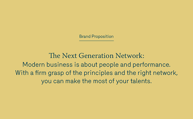
This site has an unusual concept where the main brand of the studio—GT Walsheim on a yellow background—is only featured on the top and bottom of the site. The middle section of the site features a case study and the design of this section adopts the look and feel of the actual project they designed for the client, using the same colors and the typefaces Merkury (not to be confused with H&Co’s Mercury) and Warnock. I think it’s a pretty neat approach that makes the case study feel all the more cohesive.
The Enchantments
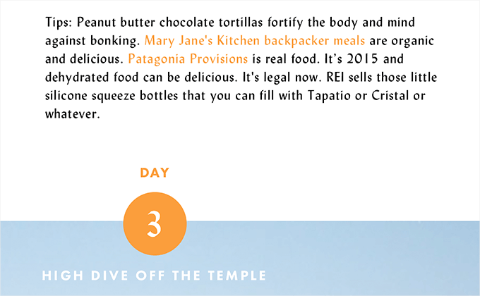
This is a really cool site that I’ve spent a lot of time checking out—not just for the great type but great content as well (“Mountain Goats are gonna drink your pee. You can’t change that.”). Lydian is a calligraphic sans-serif that you have probably seen on a paperback cover in a thrift store and I think it makes for an interesting and unexpected combo with Futura set in uppercase.
Stillmade
Big Caslon is a Caslon revival by Matthew Carter, although instead of drawing inspiration from the text styles of Caslon, Carter focused solely on the more ornate display sizes of William Caslon’s creations. It looks distinctive and elegant when set at large sizes on the Stillmade site. Univers set in uppercase contrasts nicely with it.
Loeffler Randall
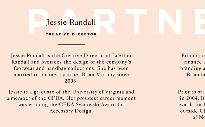
This site follows a cohesive and consistent design system using Caslon combined with Gotham which is always set entirely in uppercase. The type is set with careful attention to detail with proper quotes and apostrophes used throughout. I really dig the type treatment of Caslon overlayed on top of Gotham bold.
Nicole Fenton
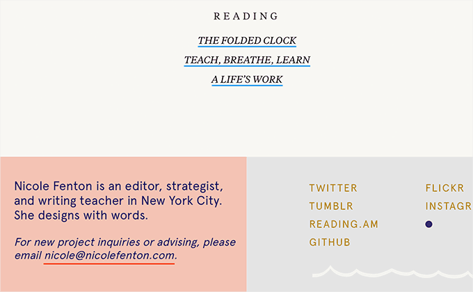
I really love this site because it uses just two typefaces—Tiempos Text and Apercu—but somehow manages to get so much out of them. The type liberally switches between italic styles as well as letterspaced uppercase, making the design feel lively and engaging. The page layout feels airy and open with generous spacing between the blocks of content while the small splashes of color help to draw the eye down the page.


