This is the 40th installment of my monthly feature on Typewolf where I share my favorite type-driven websites from the previous month and then write a little about the typographic details behind the designs. You can check out last month’s post for April here.
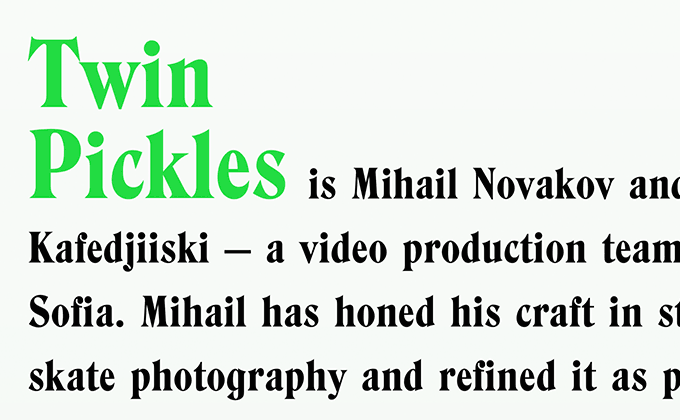
Twin Pickles
Hawthorn is a typeface that falls squarely in the “evil serif” genre with its razor-sharp, blade-like letterforms. It’s the only font used here and is strong enough on its own to create a solid brand with not much else needed. Rather than a pure white background, the type is set on a lightly tinted green background which helps create cohesion with the bright green used in the logo.
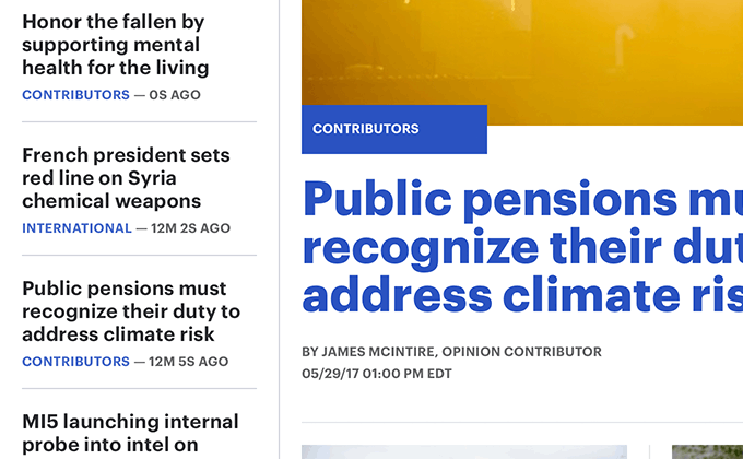
The Hill
The Hill uses Commercial Type’s Graphik almost exclusively throughout their site. Hoefler & Co.’s Chronicle Display makes a brief appearance in the footer, however, that appears to be the only place it is used. The logo looks like it is set in Chronicle Display (or something very similar), so it may have been nice to bring the serif typeface into the design a bit more. That would help to create a little more unity between the logo and the rest of the type on the site.
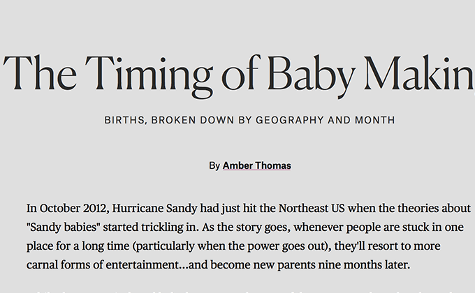
The Pudding
A few months ago, I wrote about how Canela, a typeface that isn’t quite a serif and isn’t quite a sans-serif, has been blowing up lately. Since then, it’s continued to become even more popular with four more sites on Typewolf using it. It’s paired here with the serif Publico and sans-serif Atlas Grotesk—all from Commercial Type. The type on this site is unique in that there isn’t really a consistent template used between the articles. The content focuses on data visualization and each article seems to be individually art directed to best match the visuals. Some of the pages even have their own unique type choices, using fonts from both Google Fonts and H&Co.
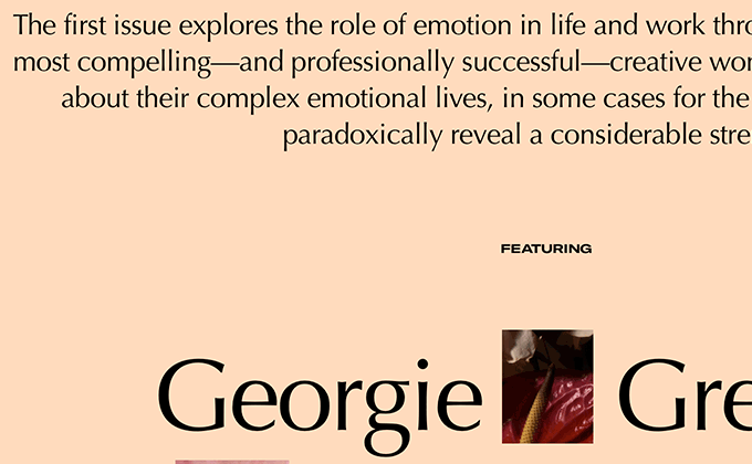
Romance Journal
High-contrast sans-serifs are making a comeback and Optima is considered a classic of the genre. It works nicely here with the subdued photography to help create a solemn mood. An extended cut of GT America is set in uppercase for the subheaders—usually it’s standard practice to add letterspacing to uppercase type, but the uppercase here actually has slightly negative letterspacing which is odd. I imagine that the font is already so wide that a tighter setting just felt more appropriate.
Man Repeller
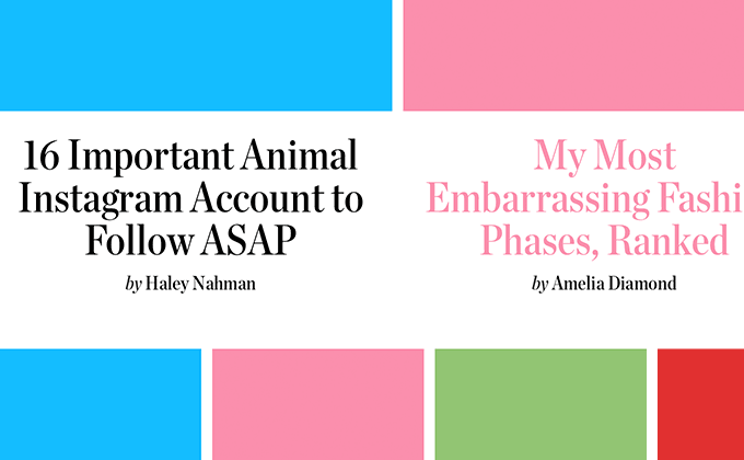
The Man Repeller redesign features bright colors combined with elegant typography. A condensed style of Chronicle Display is used for the headlines—condensed faces always work well for headlines as they allow more words to fit comfortably per line. Knockout is used for the logo as well as subheaders and auxiliary text. As much as I love the typography, I think the body text suffers from a few flaws—faux italics are used, the line length is a little too wide and there is an unusually large gap between paragraphs which breaks up the reading flow.


