This is the second installment of my blog series on Typewolf, where I identify the fonts used in popular things. The focus here is on anything you might encounter in contemporary visual culture—movie posters, album covers, TV shows, book covers, etc. You can check out the previous edition here.

What font does the Bacurau movie poster use?
The Bacurau movie poster uses the font ITC Grouch for the title, set in all caps. ITC Grouch features a distinctive curvy uppercase U and a high-waisted uppercase R, making it easy to recognize. The rest of the type on the poster looks to be using Cooper, which adds to the vintage 1970s vibe.

What font does the Body at Brighton Rock movie poster use?
The Body at Brighton Rock movie poster uses the font Molot, a blocky, uppercase-only sans designed by Roman Yershov.
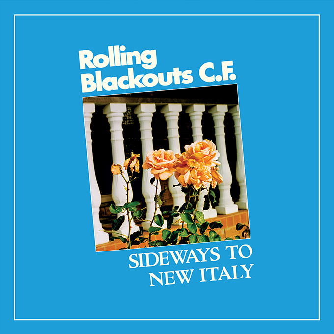
What font does the Rolling Blackouts Coastal Fever album Sideways to New Italy use?
Sideways to New Italy, the 2020 album by Australian indie rock band Rolling Blackouts Coastal Fever, uses the font Futura bold for the band name and Cloister for the album title. The Futura treatment has an artificial stroke added, which gives the letters a more rounded, bubbly appearance and smaller counters.

What font does The Politician TV show use?
The Netflix series The Politician uses the font Roslindale for the show logo, set in the bold condensed style of the display version. Additional type on the poster art (not shown in the example above) uses the open-source serif Playfair Display.

What font does the Black Is King movie poster use?
Black Is King, a 2020 film from Beyoncé, uses the font Adieu for the title in the poster artwork. Extended sans-serifs like these can be difficult to identify, especially when set in all caps. I saw this font incorrectly identified elsewhere as Shapiro, but a quick look at the uppercase G, with its bar that extends deep inside the letterform, confirms that it is Good Type Foundry’s Adieu typeface.

What font does the Space Force TV show use?
The Netflix series Space Force uses the font Eurostile for the show’s logo, set in the bold extended style. Or it may possibly be using Microgramma, the predecessor to Eurostile, which is essentially the same design but without a lowercase.

What font does the Emily A. Sprague album Hill, Flower, Fog use?
Emily A. Sprague’s 2020 album Hill, Flower, Fog uses the font P22 Aragon for the cover artwork. The typeface perfectly complements the spacey, 1960s psychedelic aesthetic.
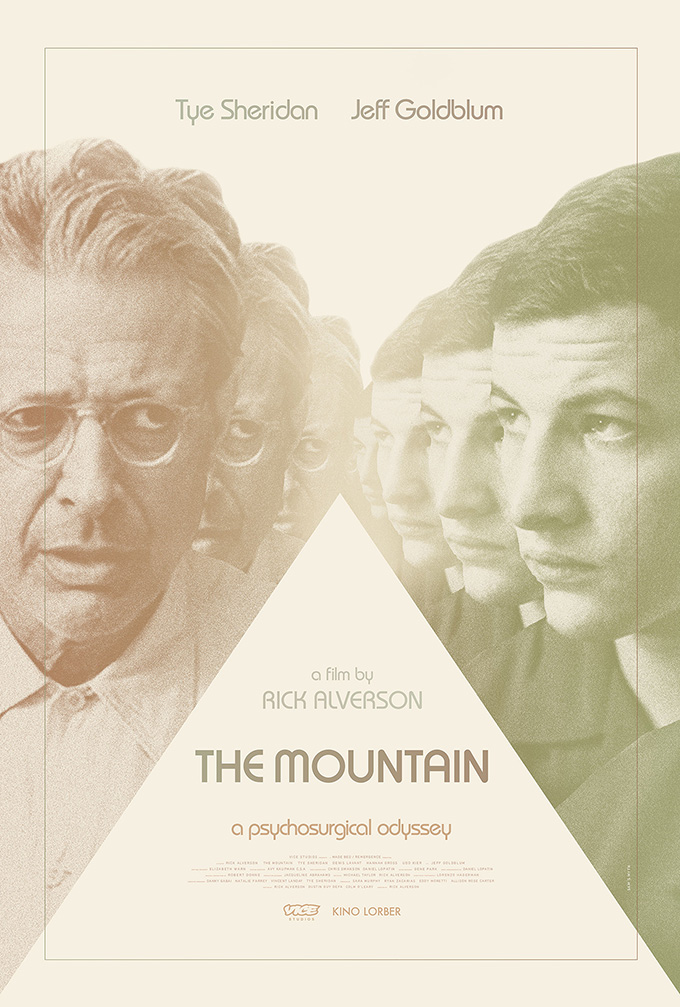
What font does the movie The Mountain use?
The poster for the 2018 film The Mountain, starring Tye Sheridan and Jeff Goldblum, uses the font Arthaus for the title. The rest of the poster type is set with ITC Bauhaus, which gives off a 1970s sci-fi vibe.
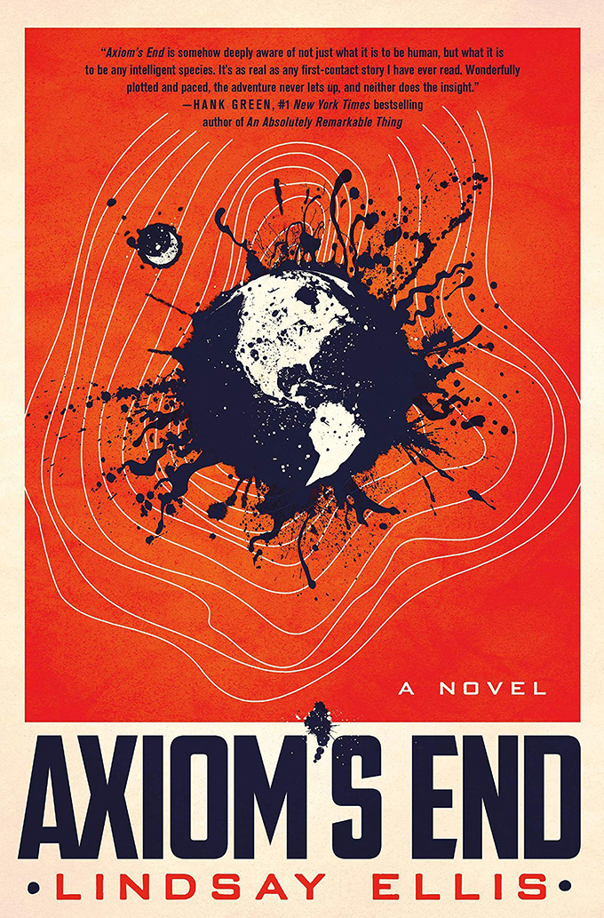
What font does the Axiom’s End book cover use?
Axiom’s End, a 2020 novel by Lindsay Ellis, appears to the use font ATF Poster Gothic for the book title and Bank Gothic for the author’s name. I’m not 100% sure, as neither font looks like an exact match. The uppercase E in the title seems to be customized with the top and bottom terminals sheared at an angle, the uppercase M has a sharper apex and the uppercase D is more rectangular. Also, the author’s name has a smudgy, blurred effect that gives the letters rounded corners. So it’s hard to say what is part of the actual font versus a custom modification. I will post a correction if anyone reaches out with a more accurate identification.
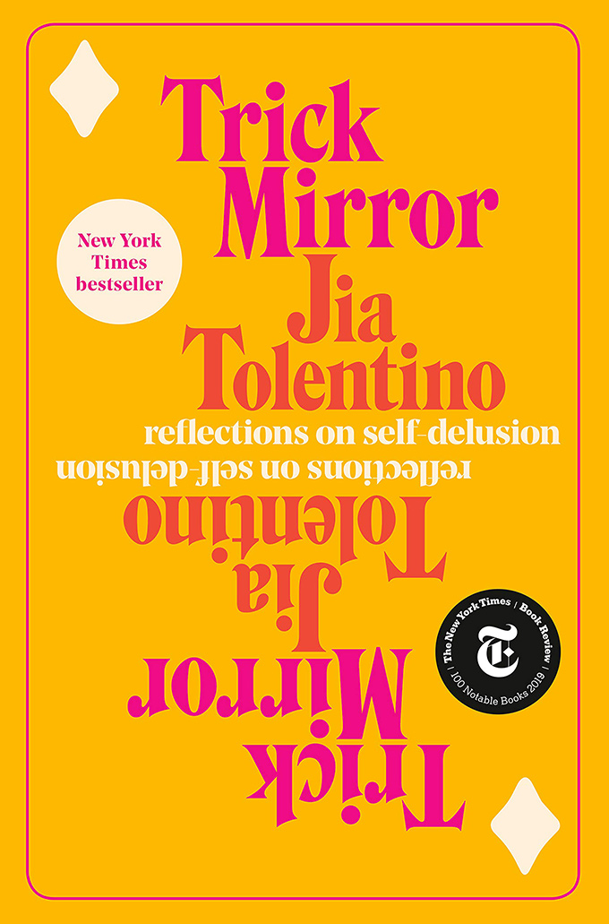
What font does the Trick Mirror book cover use?
Trick Mirror: Reflections on Self-Delusion, a 2019 novel by Jia Tolentino, uses the font Hawthorn for the book cover design. The type, along with the color treatment, recalls paperback designs from the 1970s. The smaller text for the book’s subtitle uses Noe Display from Schick Toikka.
Stay Tuned for the Next Edition
Enter your email in the box below to be notified when I publish a new post in this series. For website design inspiration, check out the Site of the Day section.
I strive to be as accurate as possible with the font identifications, but if you notice any errors, please let me know: jeremiah@typewolf.com.